What you want.
Our most comprehensive, fully supported solution: a sustainable and ongoing customer experience transformation.
Investment
$420k
Hello Jewish Care Victoria team. This is an exciting moment. You’re on the cusp of something significant: a new story, an elevated customer experience, and a sharper expression of your inspiring, vital work helping people access care, connect with community, and navigate life with confidence.
We also understand the weight of this. The work is complex, highly visible, and carries real risk. There will be passionate stakeholders, multiple perspectives to hold, and genuine pressure to deliver tangible value for customers and your team alike.
We’ve done this before. Many times over the last twenty years, on projects of comparable scale and complexity, and with results we’re proud of. That experience is what we bring to this partnership.
But August isn’t the hero of this story. We’re the guide, here to show you what’s possible and bring it to life alongside you. That’s exactly what this website is designed to do.
Three tailored pathways — from the delivery of a best-in-class website to a complete brand and customer experience overhaul — each designed to move fast, mitigate risk, and deliver substantial and significant value.
Jump to this sectionWe’re a Melbourne-based, award-winning marketing and creative technology consultancy. We have 20+ years’ experience in major brand and website projects with NFPs, and with organisations that provide aged care, healthcare, and disability support.
Jump to this sectionWe’ve delivered transformative brand and website projects for Baptcare, Mercy Health, Guide Dogs, Anglicare Victoria, St Vincent de Paul Society, and many more, with award-winning results and an average client relationship of over six years.
Jump to this sectionWe have a strong and extensive track record of delivering exceptional outcomes in complex service environments, including healthcare, aged care, disability support, community services, and the not-for-profit sector.
Jump to this sectionFrom context gathering in July through to launch in November 2026, every milestone is designed to keep you informed, involved, and confident, with ongoing support well beyond handover.
Jump to this sectionOur most comprehensive, fully supported solution: a sustainable and ongoing customer experience transformation.
Investment
$420k
A thorough brand and website uplift, enabling a fast, strategic, and commercially impactful market launch.
Investment
$200k
Delivery of a best-in-class website.
Investment
$120k
Drawing on our broad, multidisciplinary team, these are just some of the services we offer that can deliver value, well beyond the brief.
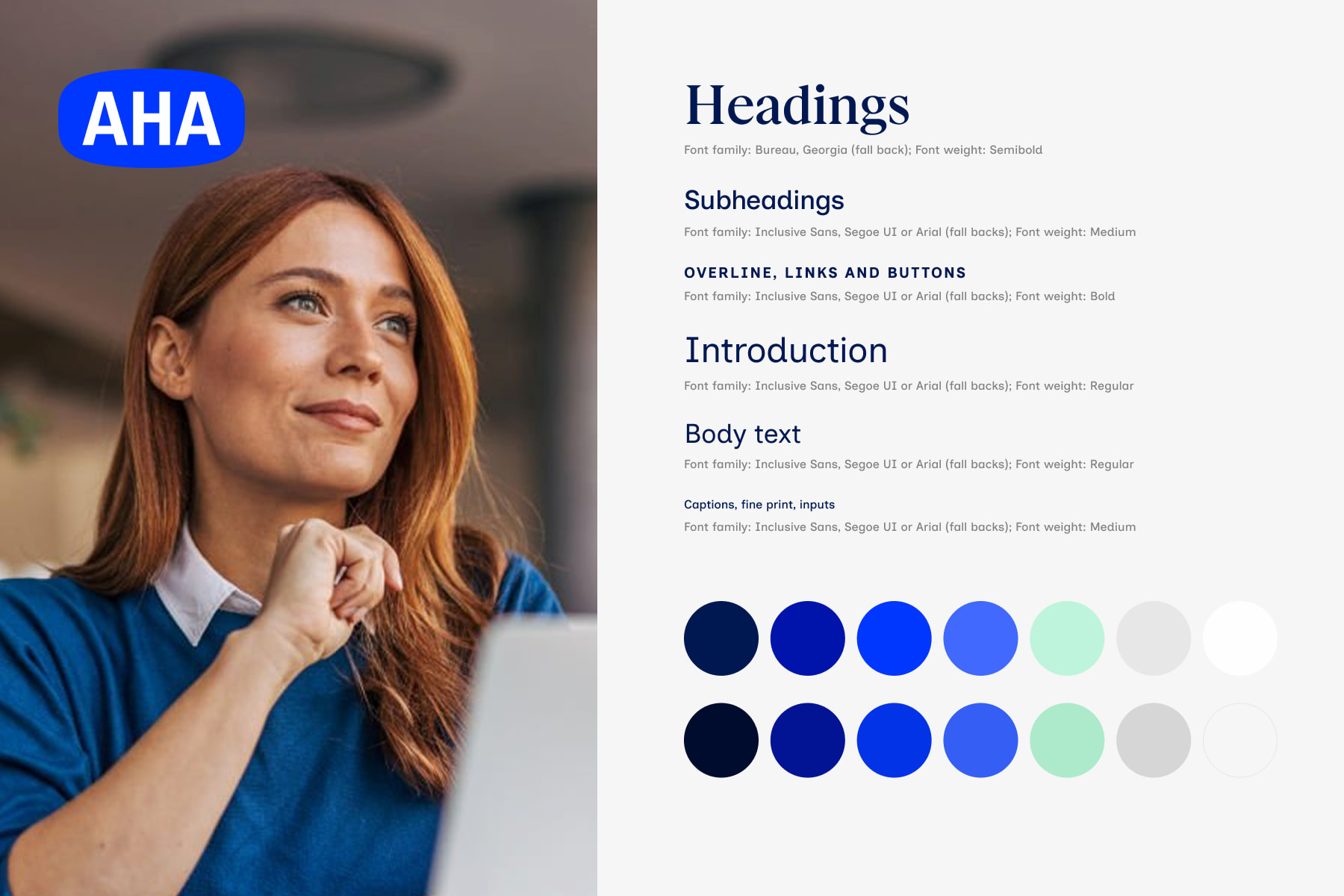
Brand refresh

Fundraising service
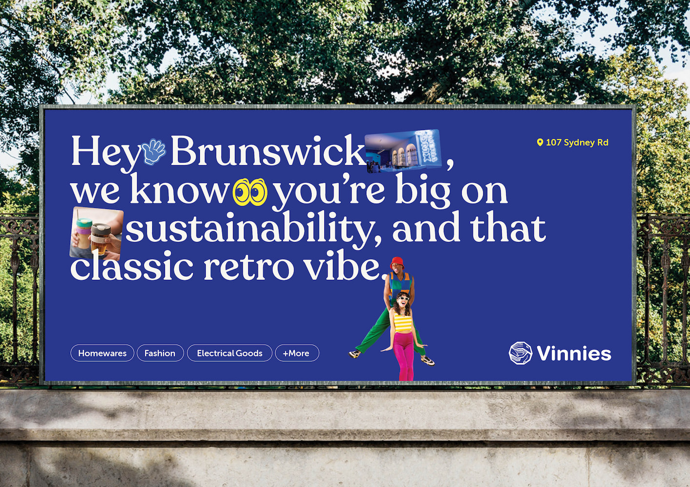
Brand awareness campaign

Merch / uniforms design
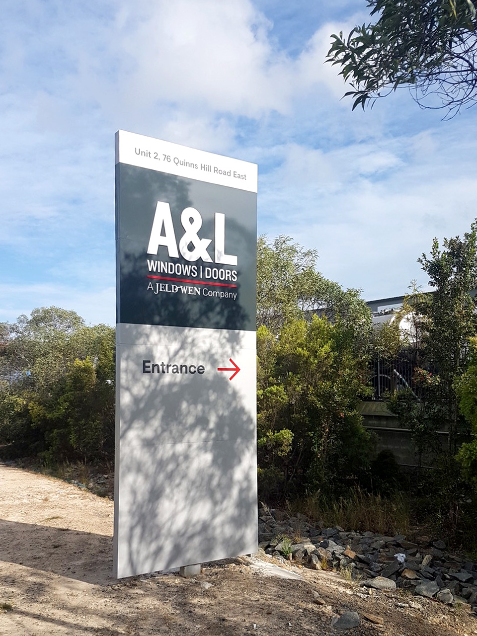
Location signage design

Photography services

Social media templates

Search engagement marketing

We've spent the past 20 years delivering sophisticated work with some of Australia's most trusted and celebrated organisations, spanning healthcare, social services, aged care, government, non-profit, and many more. We are a member of the Society of Digital Agencies (SoDA), an exclusive invite-only network for the world's best marketing leaders, creative visionaries, and technology innovators. We're also a proud B-Corp, certified to meet the highest standards of social and environmental performance, transparency, and accountability.
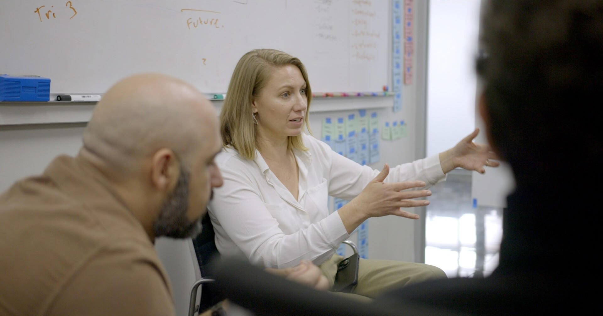
We know it can be a little hard to find details about August out in the wild. That’s intentional—we think about marketing and customer experience differently, and we’d love to elaborate on how and why. We’re also relentlessly focused on delivering value with our clients. We don’t market to everyone, because we don’t work with just anyone.
Our success comes from true collaboration with teams that match our ambition and enthusiasm for impactful, meaningful work. We’re excited by the opportunity to support Jewish Care Victoria’s with exactly that: helping people to find support, connect with community, and navigate life with confidence.
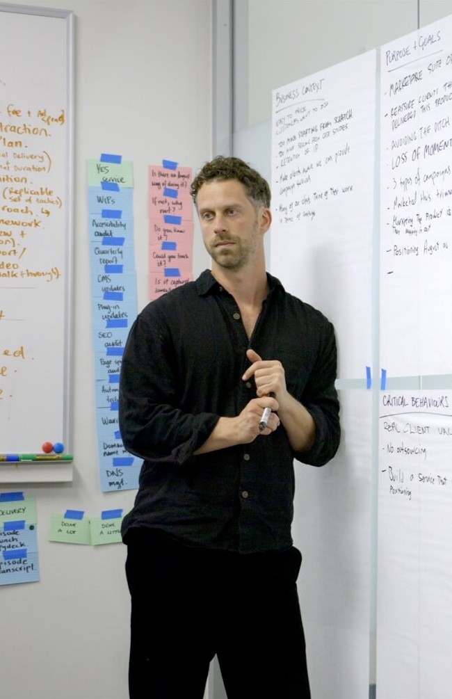

When you partner with August, you get a tightly knit multidisciplinary team operating in constant consultation as an extension of your own. Design, development, content strategy, UX, and SEO specialists working together at every step, with the same people involved continuously for the full lifecycle of the project.
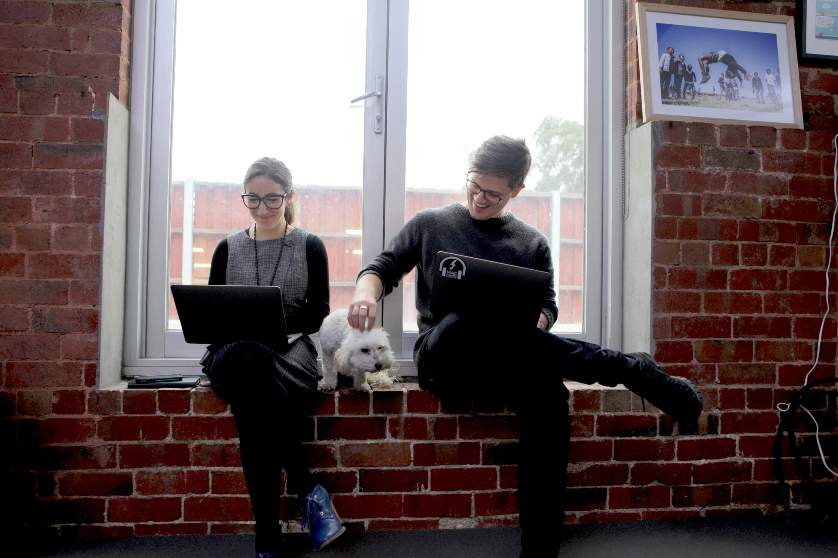

We are proficient with many tools and we advocate for choosing the right one for the job, not simply the product we have a license or existing affiliation with. An experienced partner will collaborate to establish a thorough understanding of Jewish Care Victoria’s context, objectives, and long-term strategic ambitions. Then, select the optimum technology solution based on those current and prospective requirements. That said, we like to acknowledge potential candidates, along with considerations you should be mindful of when assessing CMS.
We have delivered award-winning websites with enterprise-level clients, implementing WordPress to meet stringent requirements for security, performance, scalability, and accessibility.
We have delivered high-quality and highly accessible work with Craft CMS, including the website for Australia’s leading Disability News Source, Powerd Media.
Both of these options could also provide a suitable backend for a headless solution for the CMS, where the presentation layer is decoupled from the backend of the CMS. This approach becomes particularly compelling when front-end performance is critically important, or to align with the requirement for multiple future Jewish Care Victoria channels to be managed from a single backend. For example, with the development of Jewish Care Victoria client mobile apps.



We produce highly effective, award-winning, and sophisticated websites with the exact capabilities you’re after. From healthcare and aged care to disability support and community services, our work across the sector demonstrates that we can deliver. When it comes to helping mission-led organisations realise their potential through outstanding customer experiences, August is recognised as the best in the business in Australia and worldwide.
A tightly knit multidisciplinary team is critical to the success of an effective website project, particularly given the sophistication and ambition required to match Jewish Care Victoria's objectives.
When you partner with August, that's exactly what you'll have. In our team, design, development, content strategy, UX, and SEO specialists operate in constant consultation as an extension of your team. This ensures highly impactful work and eliminates the risks that occur when disciplines are siloed or isolated. With every specialist involved at every key juncture, you avoid the risk of designs being difficult to build, content being disconnected from search best-practice, or scrambling to implement SEO or accessibility considerations retrospectively.
Here are some of the specialists who'll be present and involved throughout the delivery of your project.
Removing buyer’s remorse when choosing a digital agency — six considerations to help you pick the right partner.
Seven proven techniques to drive greater value from a not-for-profit’s digital fundraising campaigns.
How small, considered words — the marketing afterthought — create a massive impact for not-for-profits.
How to align a multi-stakeholder not-for-profit around a brief that sets the project up for success.
The unexpected organisational benefits design systems offer not-for-profits, beyond consistency and efficiency.
Why not-for-profits should move from building audiences to building communities — and the value that unlocks.
Five surprisingly easy ways to connect with diverse audiences as a social services provider.
Headlines do the heavy lifting — here’s how to make the rest of your content earn its read.
Five often-overlooked essentials that are crucial to creating an impactful digital brand.
How to keep multiple contributors and stakeholders in harmony while producing content at scale.
Surveys, interviews or workshops — how to gather the right information from key stakeholders.
Publish once and populate many areas with a ‘no wrong door’ approach to content architecture.
Seven easy tips to start designing WCAG-friendly websites that work for everyone, not just people with disabilities.
How a lack of accessibility quietly costs not-for-profits fundraising dollars, and six techniques to win them back.
Eight tips and techniques for accessible, inclusive design, and what Stevie Wonder has to do with it.
Collaborative workshop designed to efficiently onboard stakeholders, set strong foundations for success, and ensure close alignment between our teams.
Walkthrough of the brand creative including tagline, brand narrative, positioning strategy, flexible graphical assets, typography, colour, photographic styles, and digital applications.
Refined based on your feedback. Assets shared for your team to start making use of the new creative.
Weekly sync meetings allows us to run a full website development in close collaboration with you, built in accordance with August’s award-winning delivery standards
Not just handed over and forgotten. We support our clients well past handover.
A great launch is the start, not the finish. We keep measuring what matters and partner with you on the next opportunities as they emerge.
We look forward to partnering with Jewish Care Victoria to create a stronger foundation for growth, engagement, and service delivery. Together, we’ll deliver a contemporary experience that makes it easier for people to access support, connect with community, and confidently engage with your services.

A national not-for-profit supporting people experiencing hardship — and a digital experience that had to be effortless for everyone who relies on it.
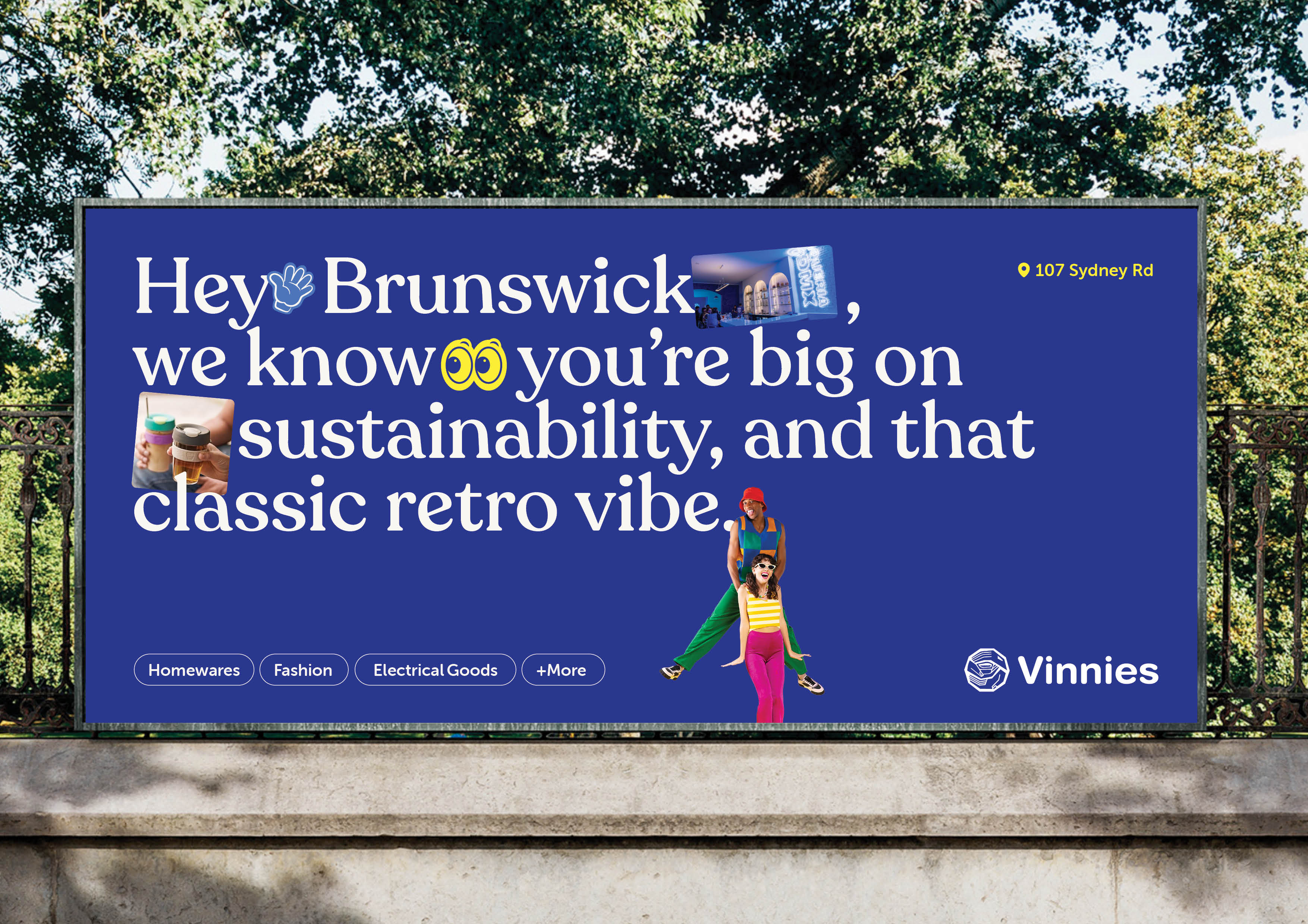
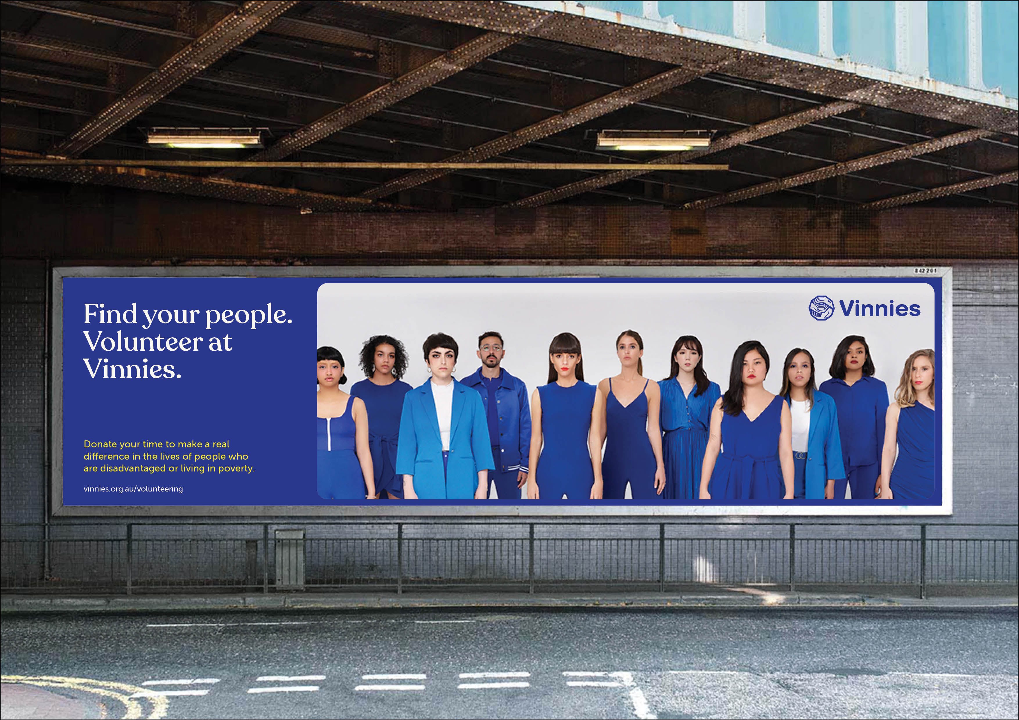
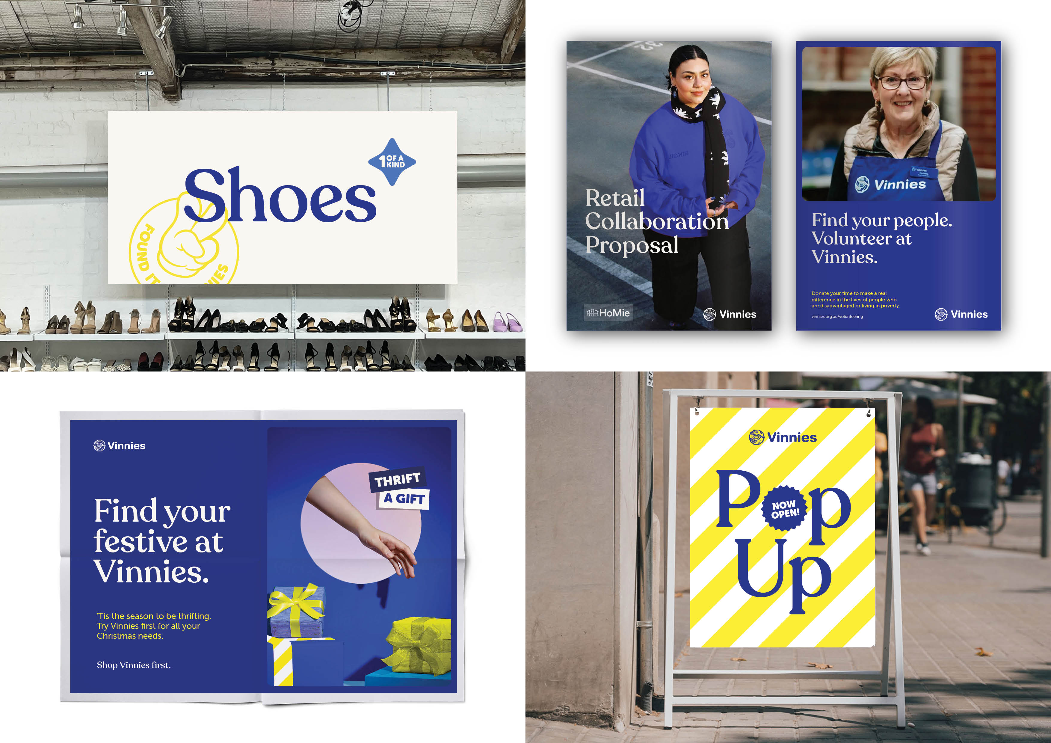
The St Vincent de Paul Society (Vinnies) is a highly recognisable brand that Victorians know and love. Visiting the retail stores is unique, easy, and fun. It’s an experience defined by the exciting anticipation of the next ‘all-time’ find, the warm welcome and strong sense of community, the quality items, and good vibes. Vinnies engaged in a rebrand with an opportunity to deliver the same, by better encapsulating the warmth, optimism, and fun sense of discovery that people experience while shopping. At the same time, Vinnies hoped to adjust their position in the minds of shoppers — moving from traditional community ‘op-shop’ to align more with department store aesthetics and brand cues, and reflect the mix of quality and value they provide. We partnered with Vinnies to develop a cohesive brand and communication system spanning in-store retail environments, campaigns, and digital channels. The approach has elevated the quality of the in-store experience, improved wayfinding, and created a repeatable framework that can be deployed consistently across diverse store formats and layouts. Performance data also suggests it has drastically improved campaign performance, and helped Vinnies establish a new benchmark for purpose-led retail.
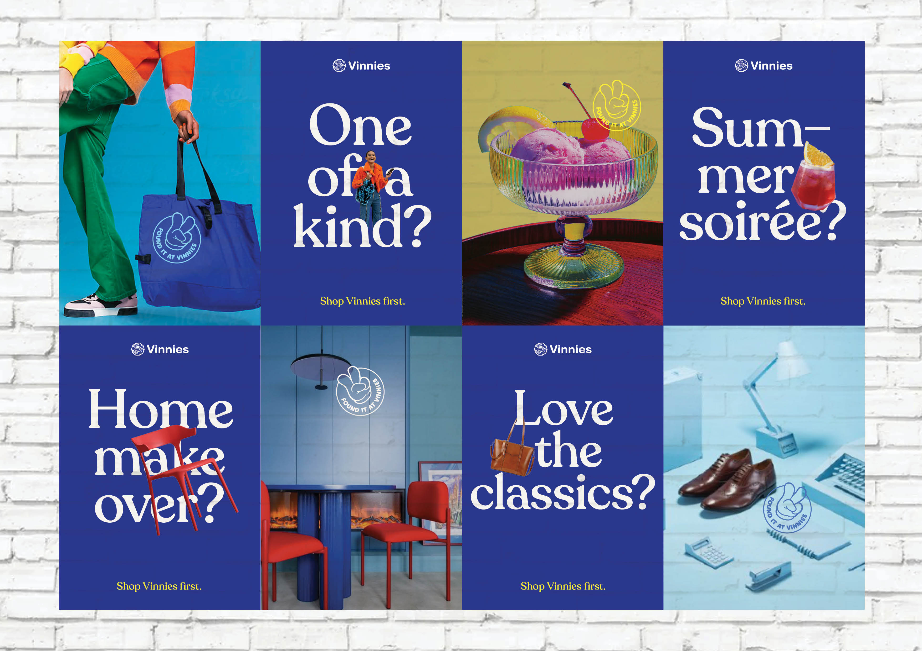
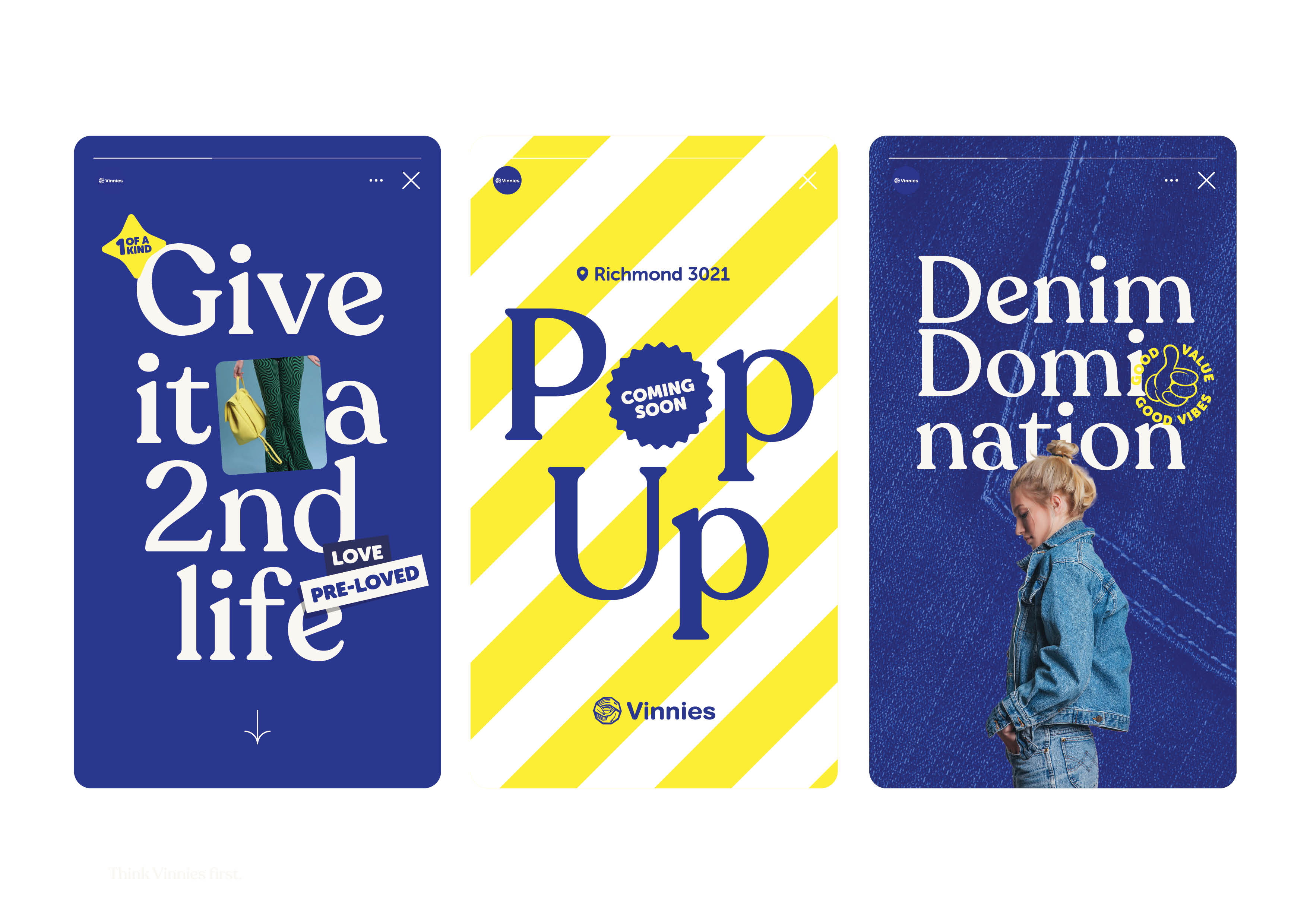
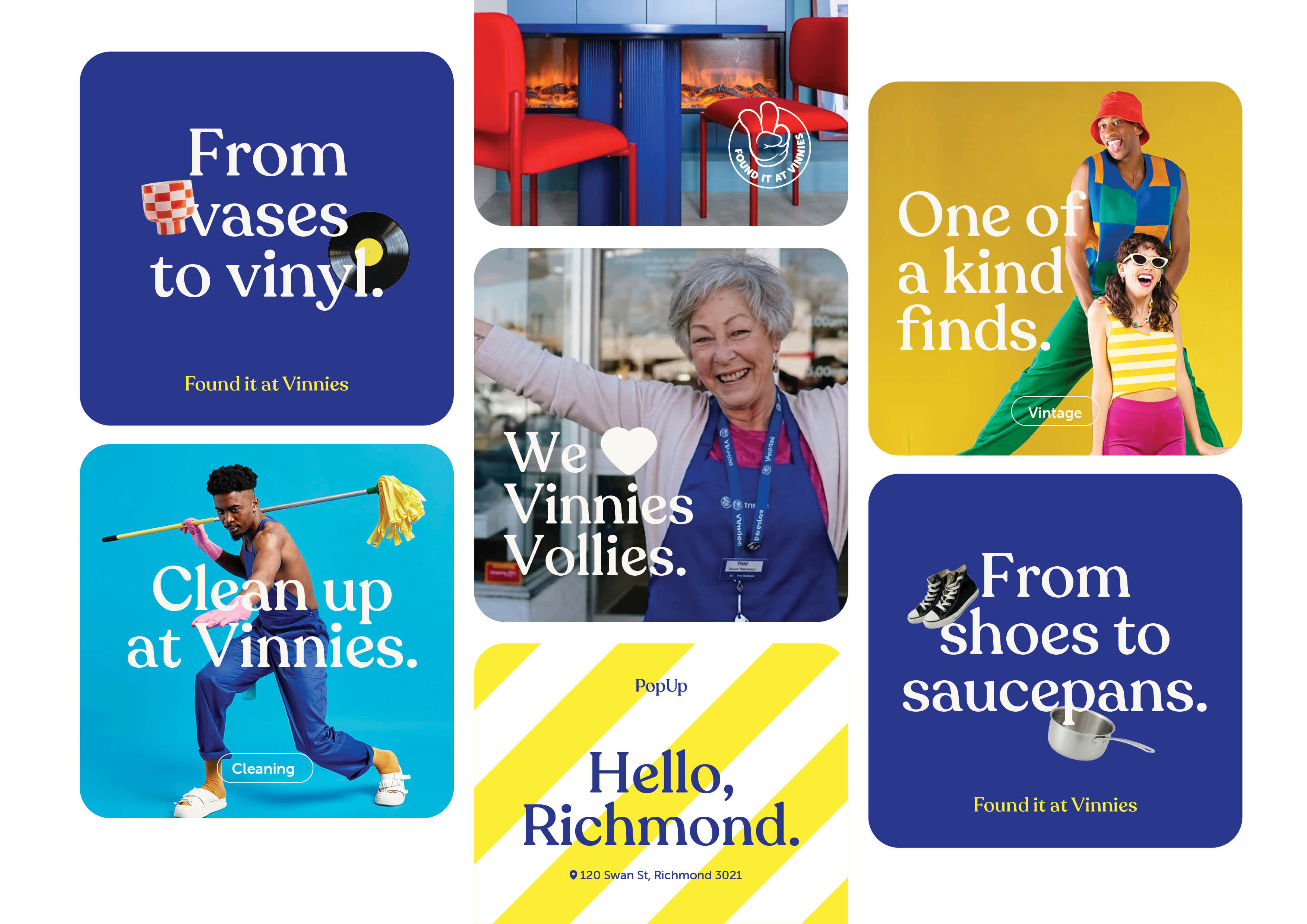
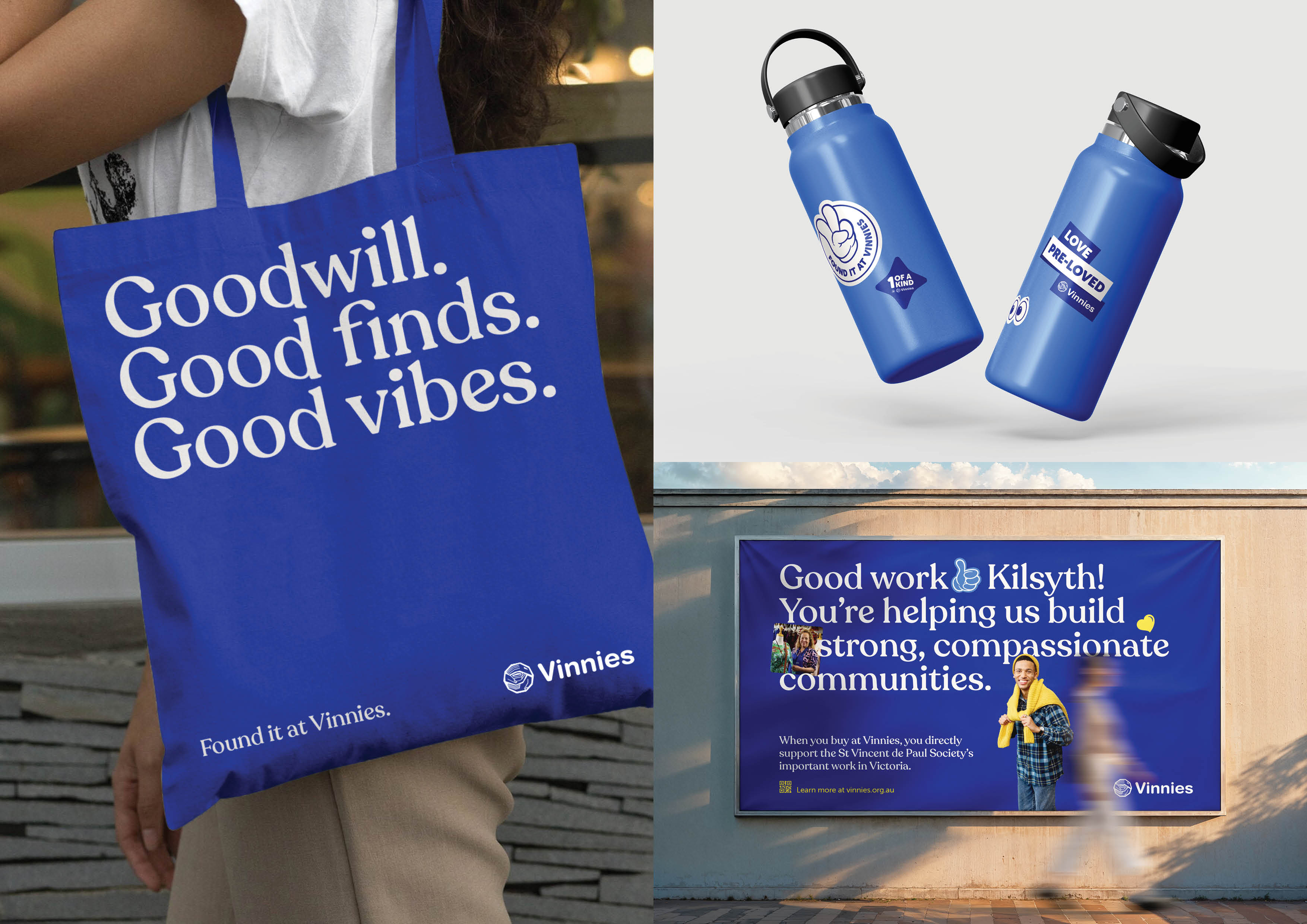
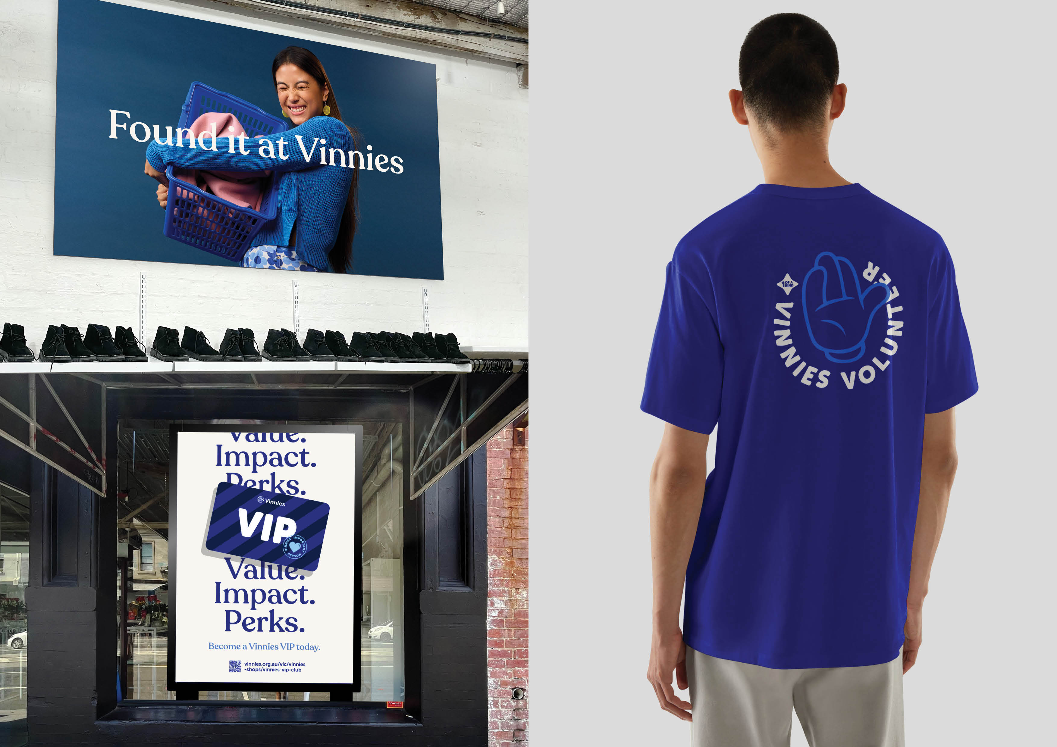

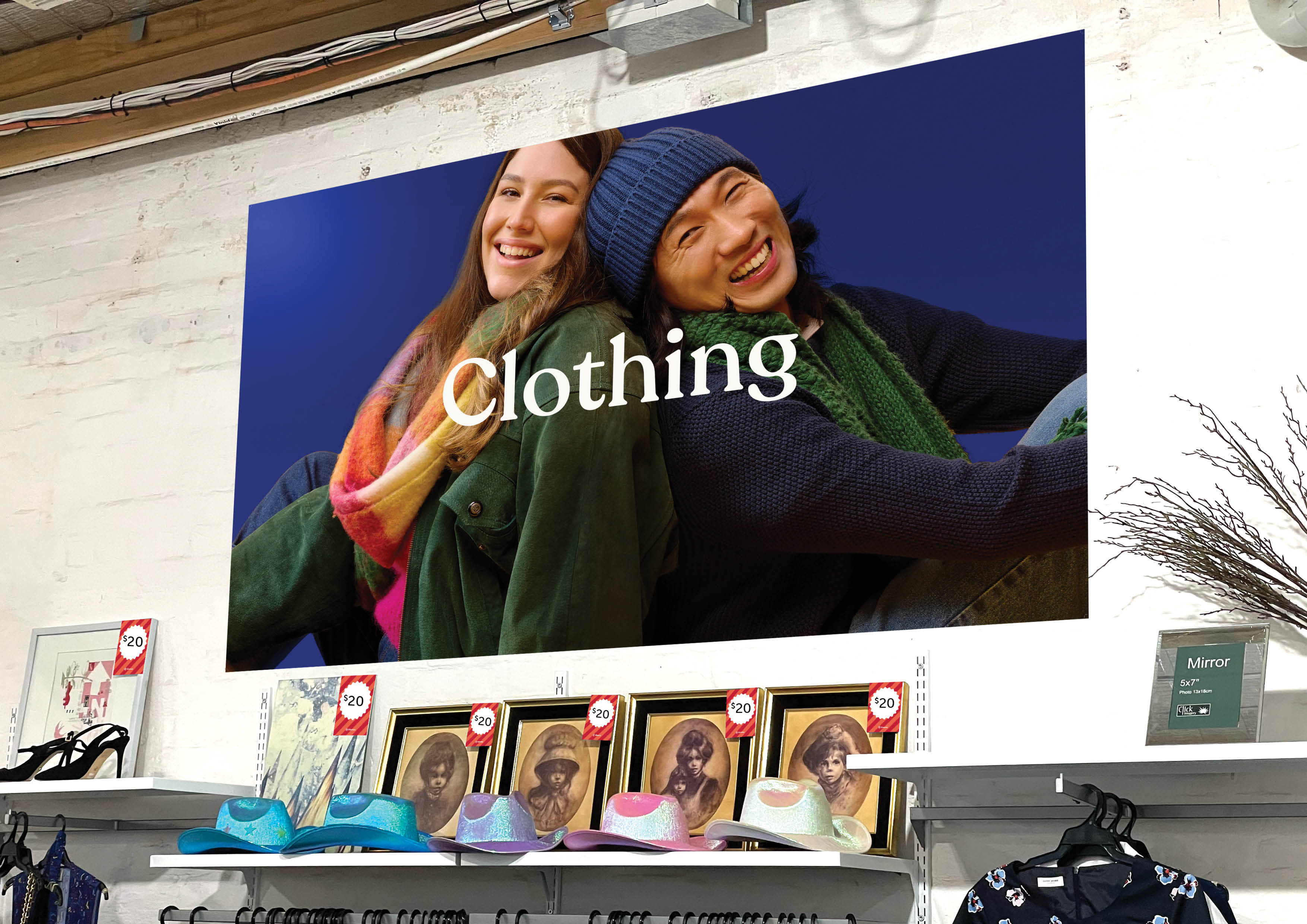
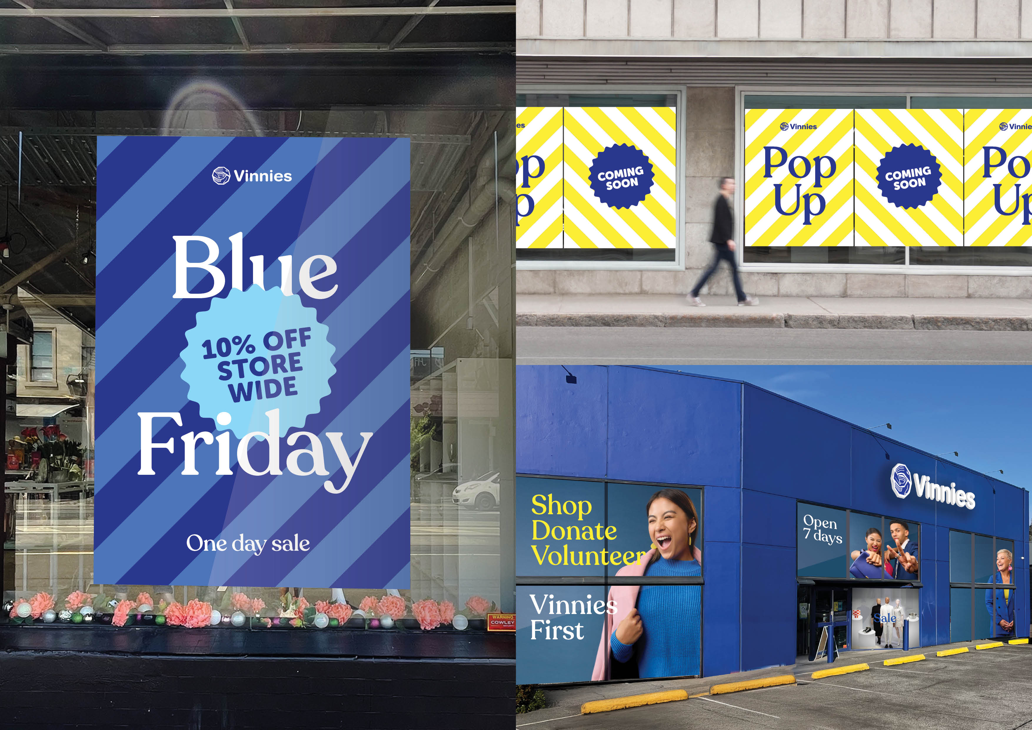
An iconic, deeply trusted brand where accessibility isn't a feature — it's the entire point of the work.
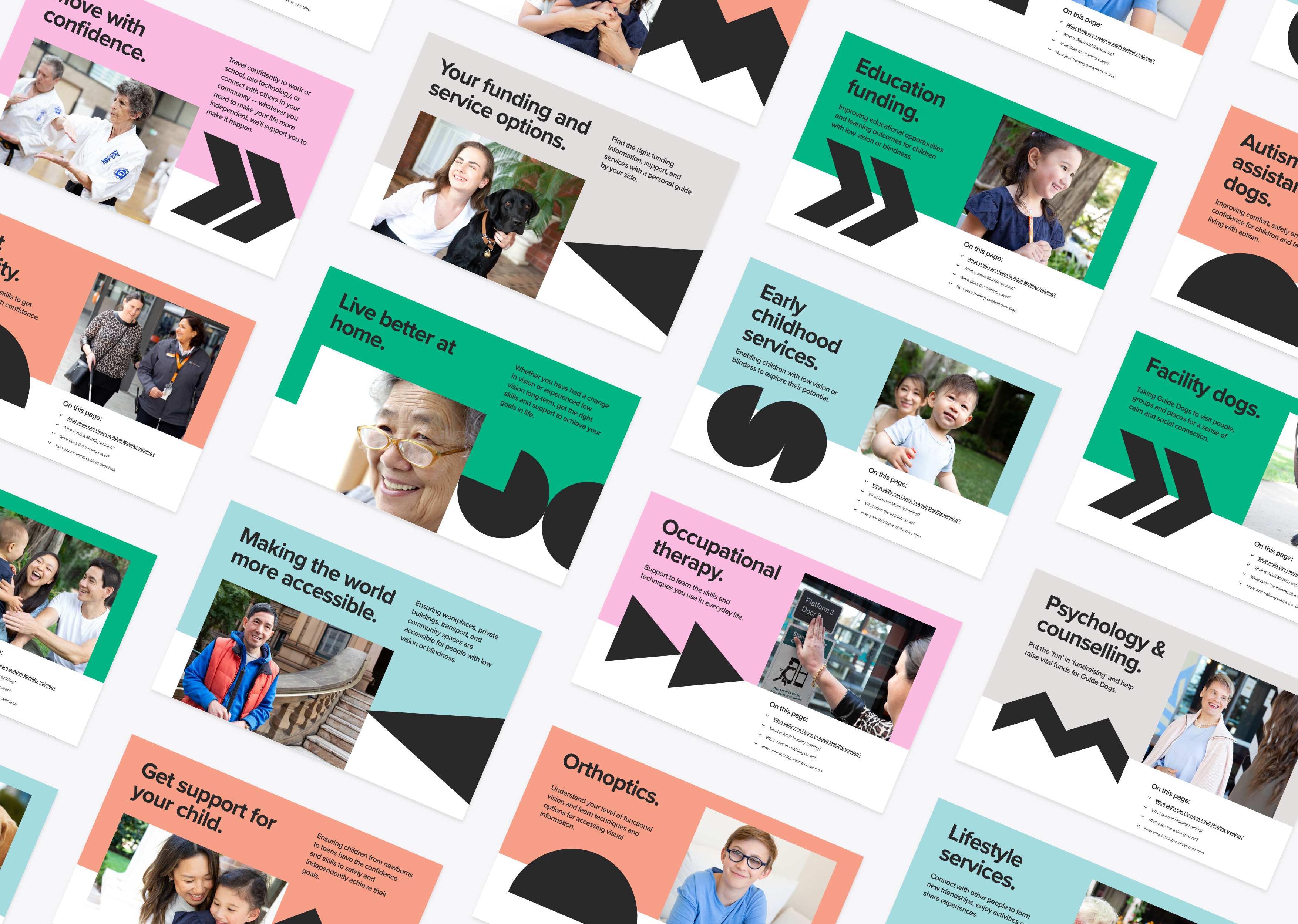
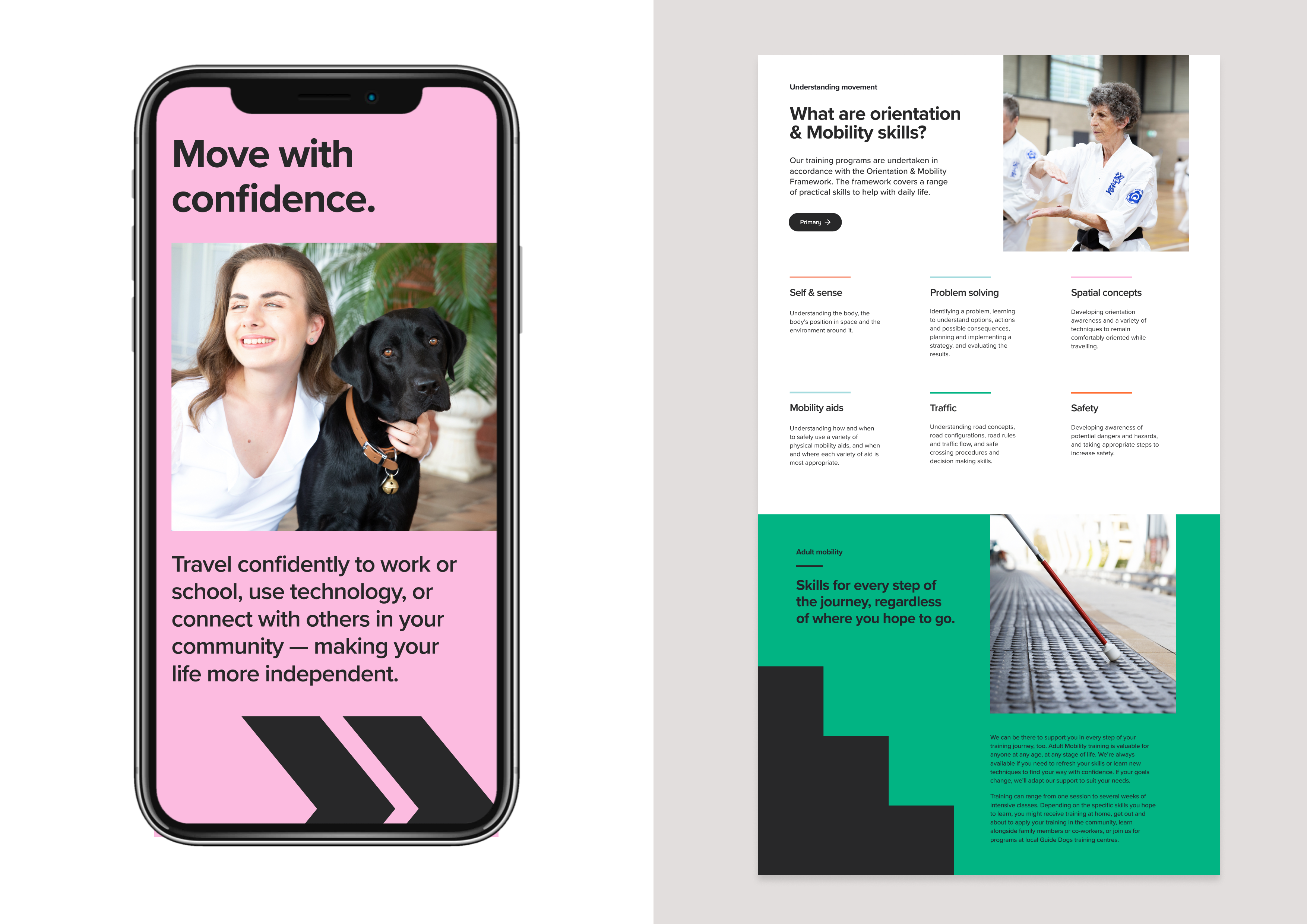
As Australia’s leading provider of vision services, Guide Dogs is all about learning skills to move forward with confidence. Through a collaborative co-design process, we partnered with the team to help them do exactly that. The project involved moving to a unified presence following a national re-brand and embracing a more aligned federated model, where every state-based Guide Dogs organisation is closely aligned in aesthetics, terminology and tone-of-voice, digital systems and processes, and much more. We continue to work in an ongoing collaboration with Guide Dogs teams around Australia, supporting their team with marketing support, performance analysis and reporting, conversion rate optimisation, accessibility testing and best-practice development, and fundraising campaigns.
Gold winner at the 2021 International W3 Awards.
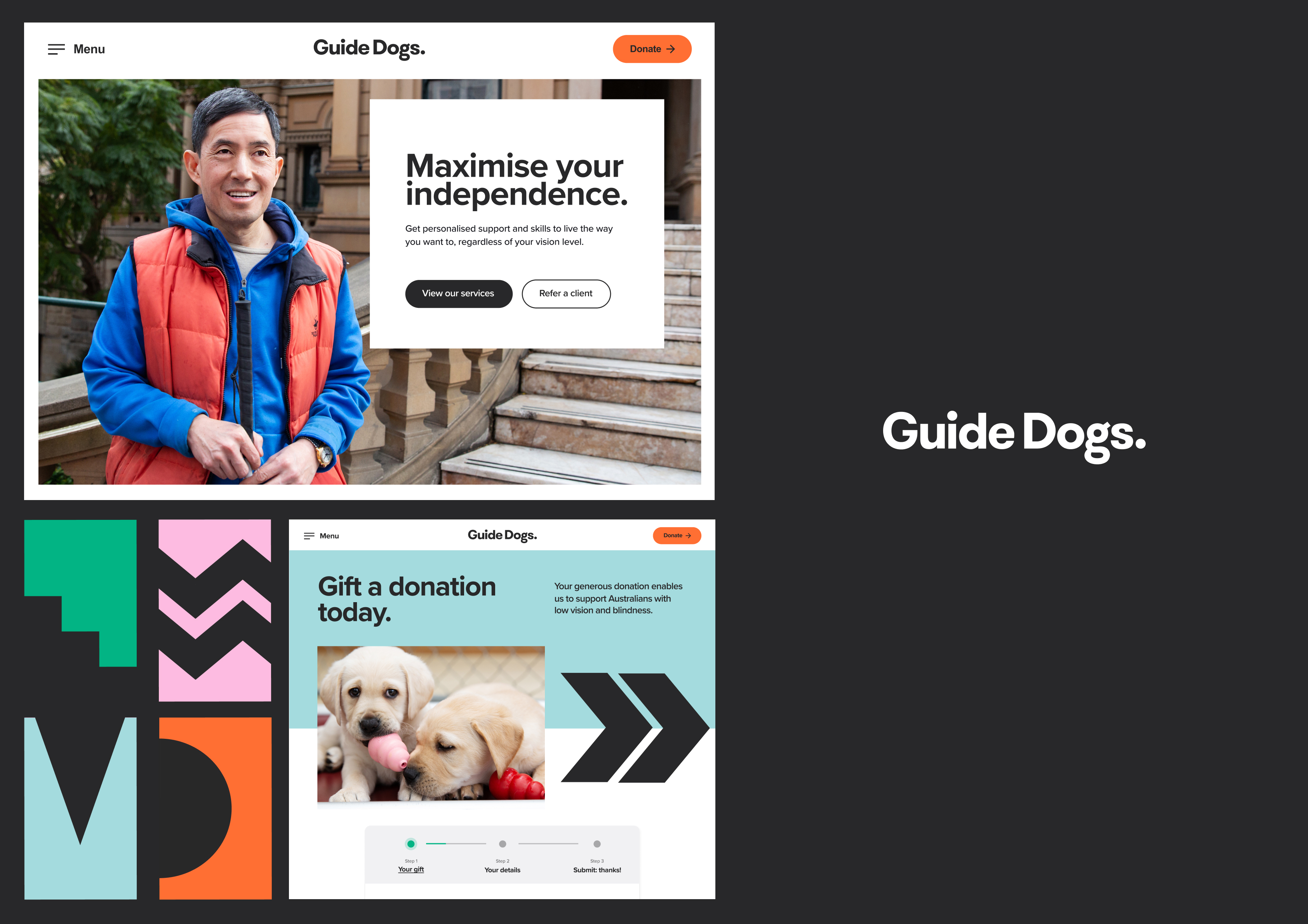
One of the country's most recognised advocacy organisations — and a platform built to turn awareness into action.
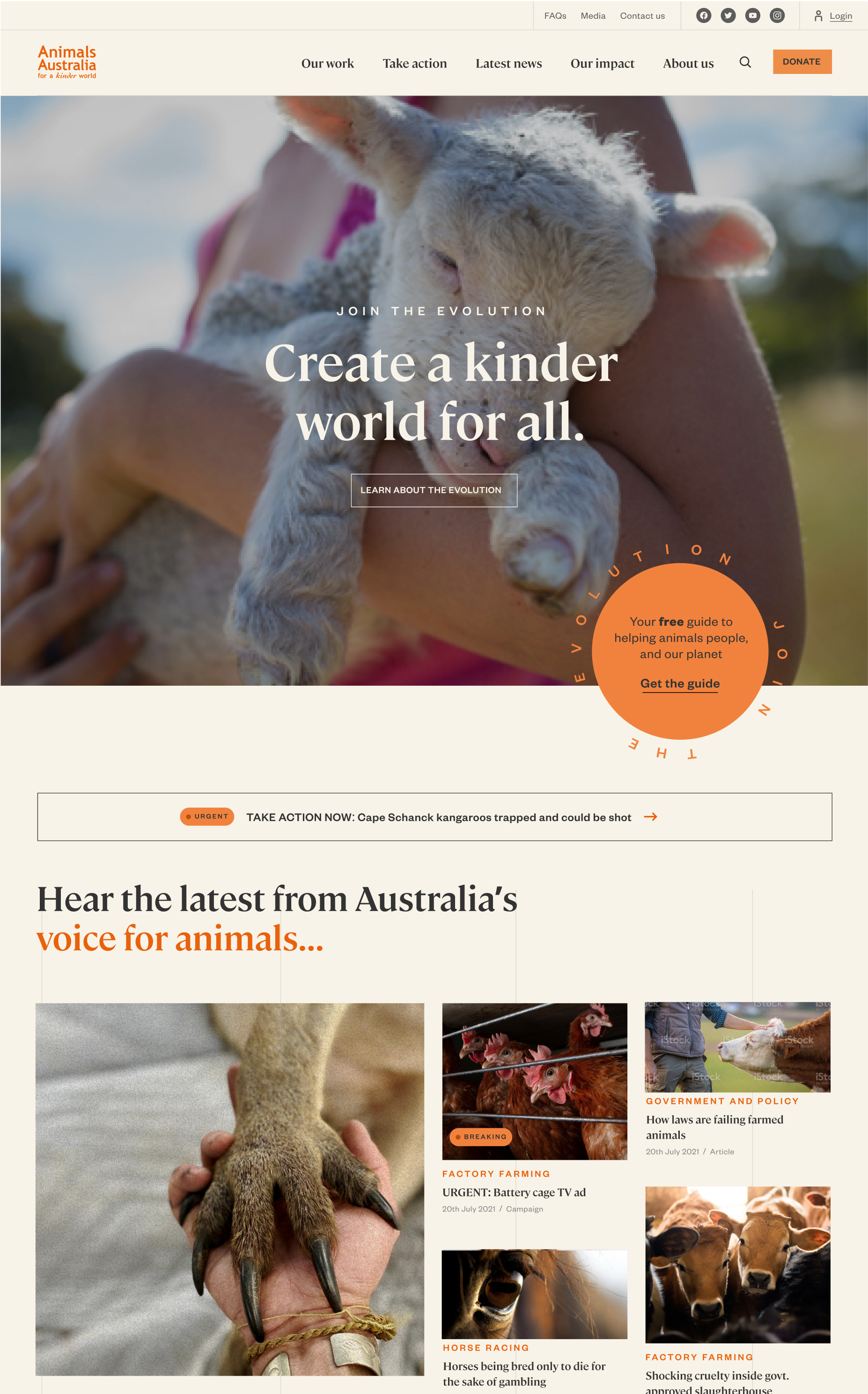
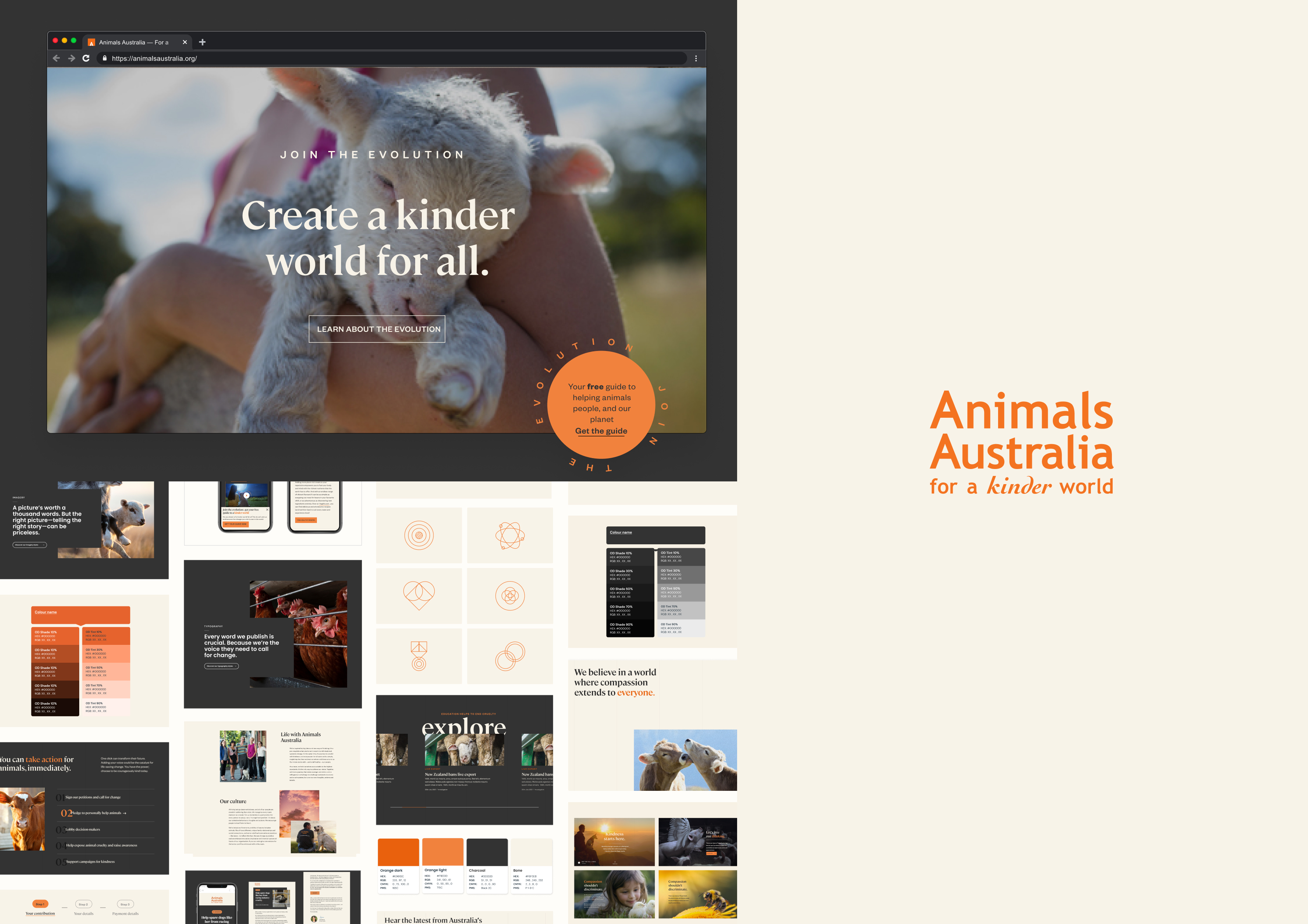
Every day, all around the world, newborn dairy calves are taken from their protective mothers and sent away: bewildered and only days old. Factory-farmed chickens rise to a false dawn of harsh, halogen lighting. Thousands of sheep, scared and disoriented, file onto live export ships, crammed together in dangerous conditions to await an awful fate. The systems that treat animals as objects are inherently cruel. But there is always hope. By collaborating to build a new series of systems — a robust and flexible brand design system, a best-in-breed content management system and editorial publishing platform, a brand management system, a donor self-service and member management system, and more — Animals Australia is equipped to shine a light on these atrocious, outdated practices, and advocate for a kinder world for all living beings.
MacFarlane Prize for best site at the Australian Web Awards 2022, and multiple wins across AGDA Awards, Good Design Awards, and the W3 Awards.
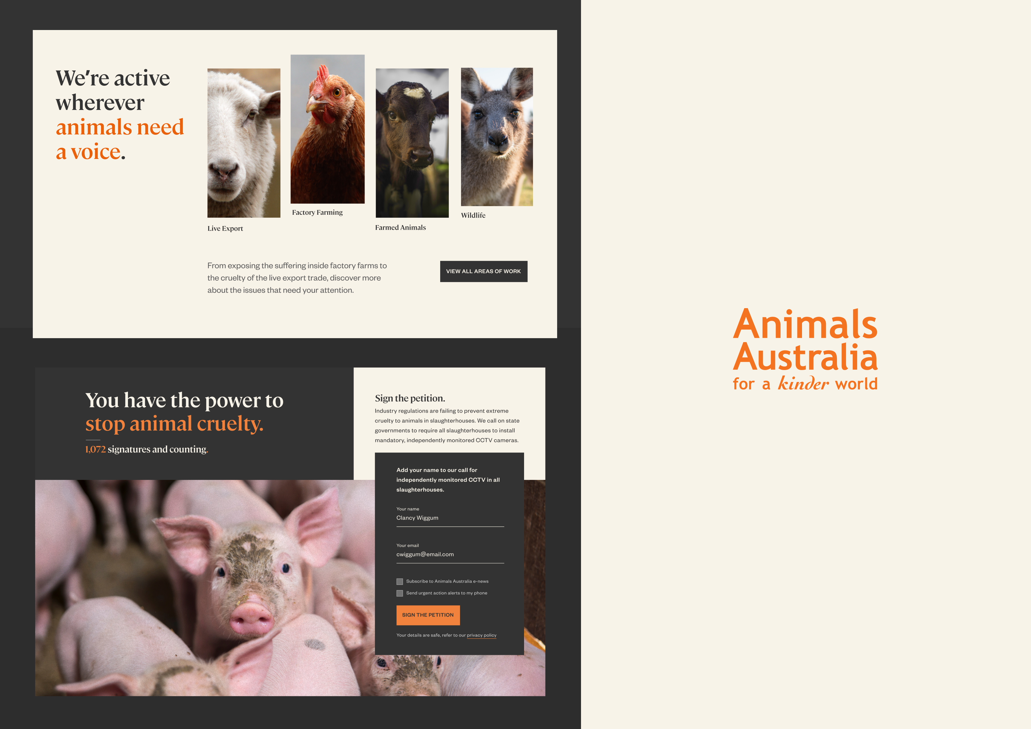
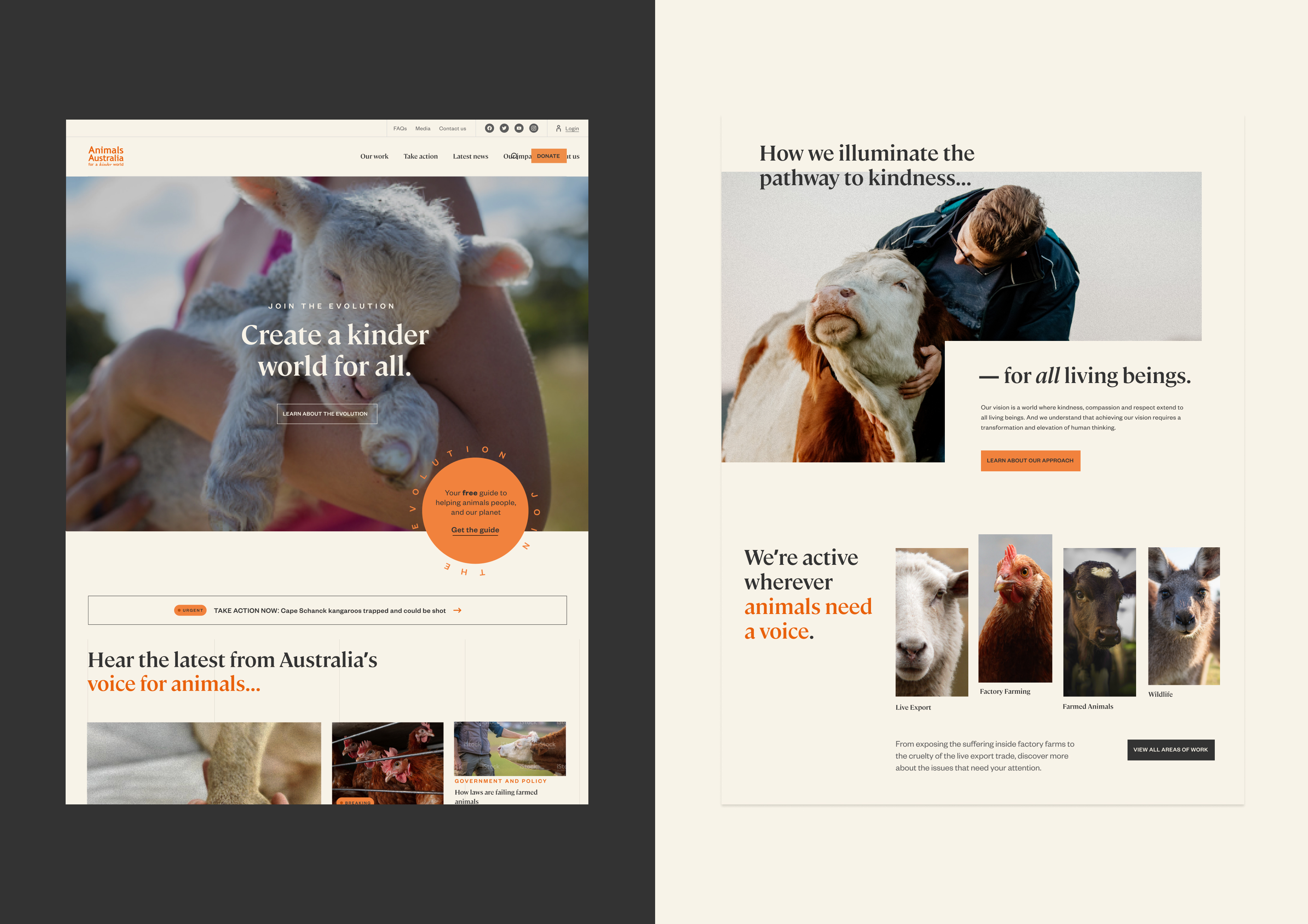
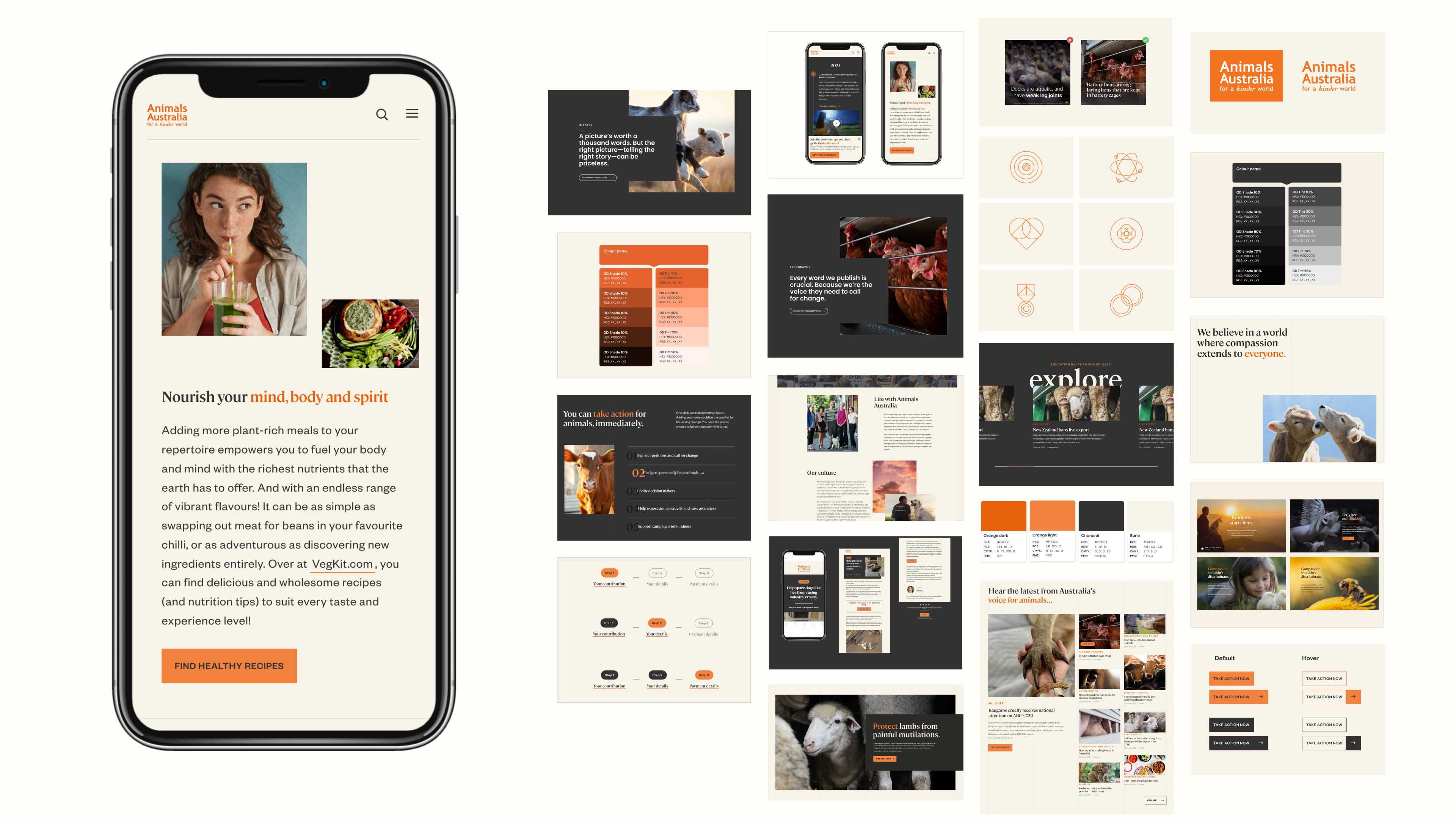
A complex, member-driven organisation with a broad set of audiences and a single, maintainable platform to serve them all.
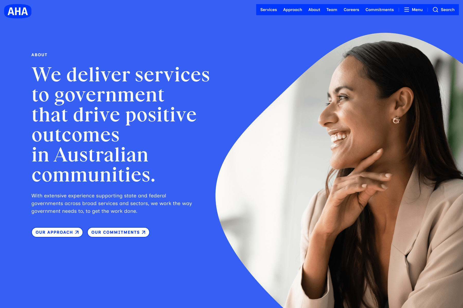
AHA (previously Australian Healthcare Associates) was founded over 35 years ago as Australia’s largest specialist healthcare consultancy. The team has a unique skillset and an exceptional track record in supporting government to deliver vital, sophisticated services to the community — things like aged care assessments to determine access to appropriate funding, facilitating specialist interviews and eligibility processes to provide students with disability with the right supports, and administering pharmacy programs across the country on behalf of government.
Increasingly, the team’s capability and experience has grown far beyond being exclusively relevant to the healthcare sector. While this creates a raft of opportunities, it also presented a brand and positioning challenge, particularly around the perception of the organisation’s health-specific name, positioning tagline, brand, and website. To overcome these challenges, we’ve worked with AHA to develop a new brand narrative and tagline — ‘AHA stands for trust’ — a modernised visual aesthetic, and full supporting website project. The result is a more appropriate reflection of AHA’s expertise, compellingly conveying the unique capability they’ve honed over time, their strong reputation, and their unique methodology in partnering with government to deliver essential services for the community.
Please note: this work is scheduled for an upcoming launch in July and is not yet live in market.
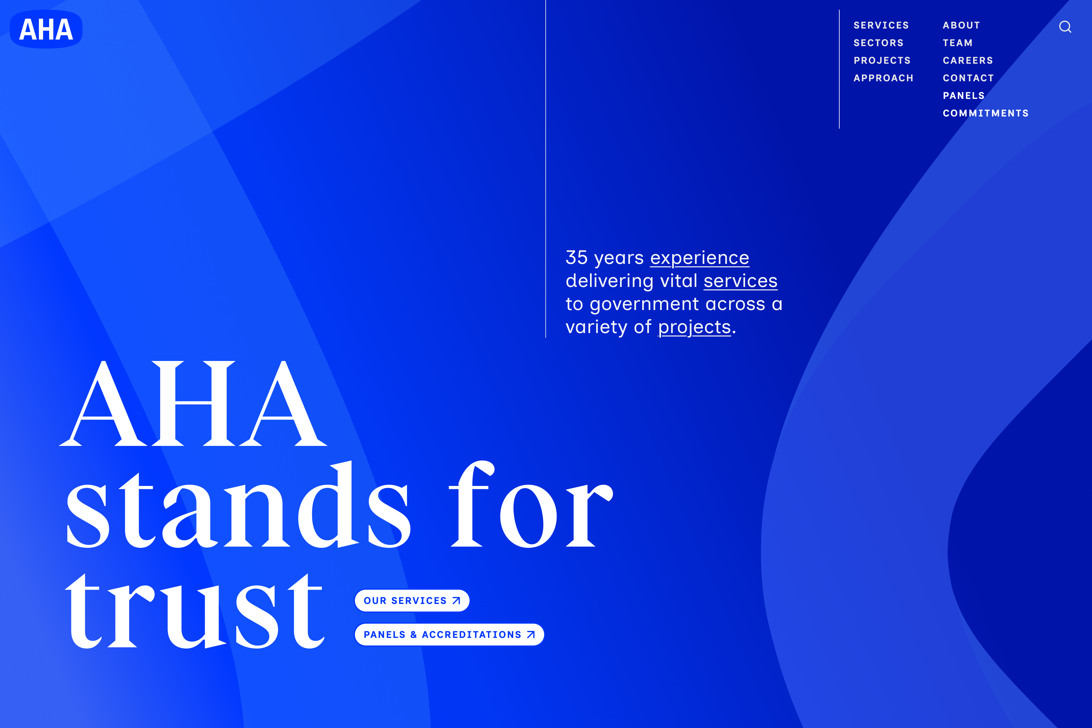
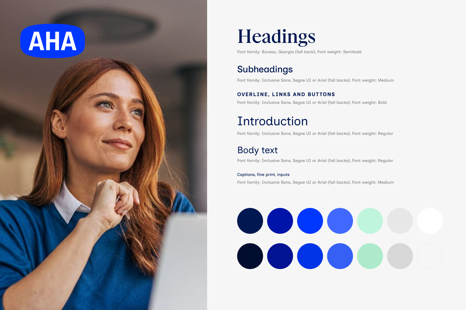
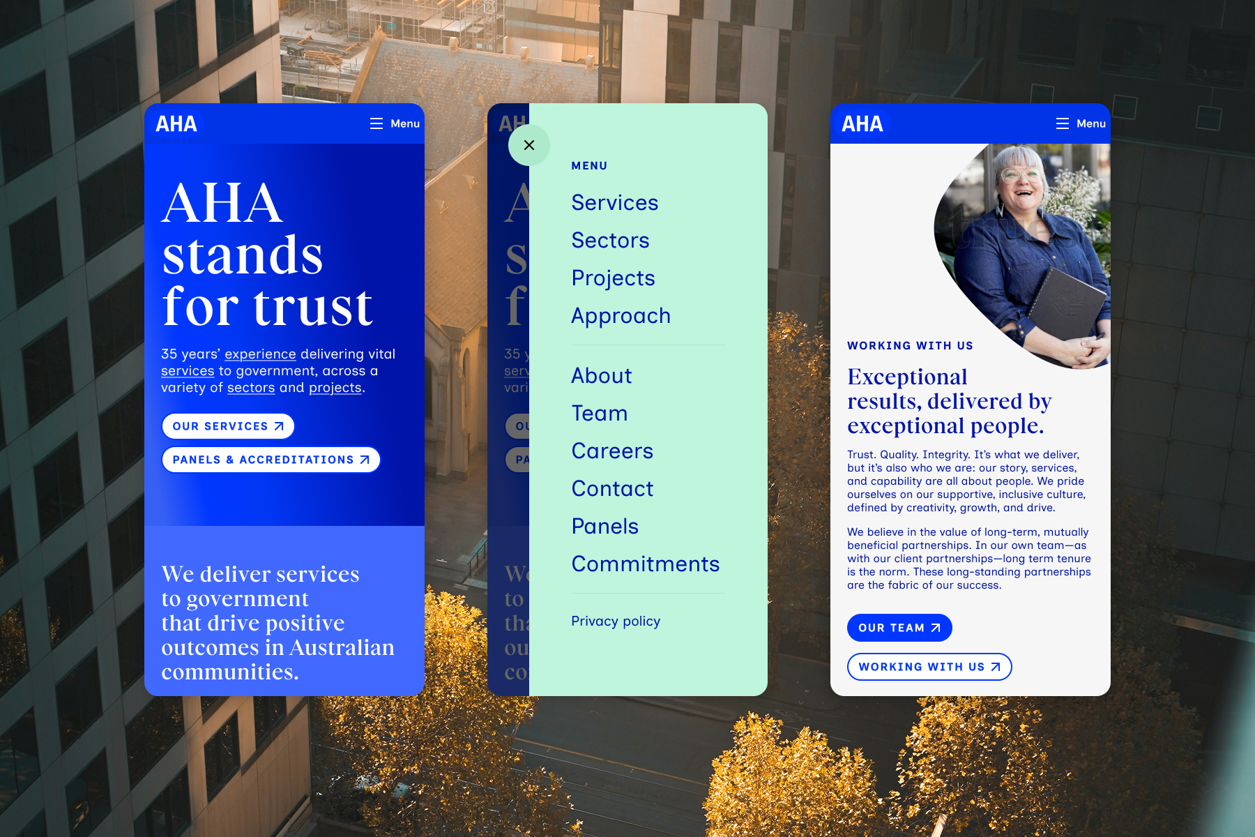
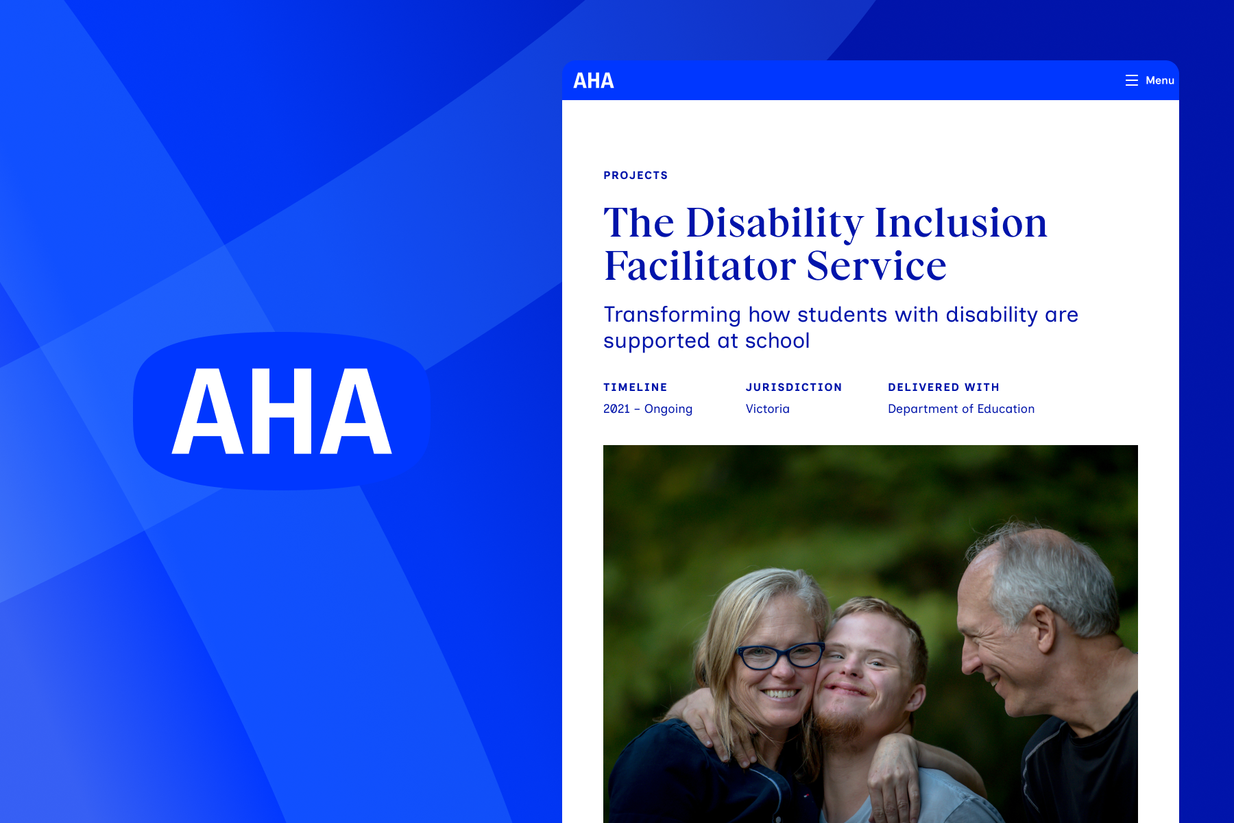
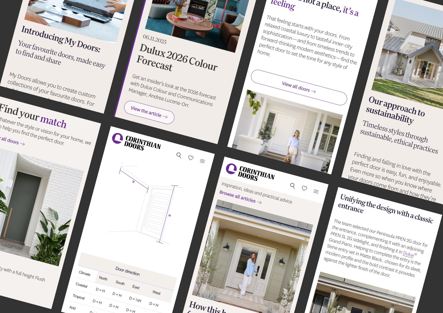
Design excellence for Australia’s leading door manufacturer.
Corinthian Doors is Australia’s leading manufacturer of premium quality doors, frames, and systems. With over 1.2 million doors sold per year, their products are lauded by design-conscious and highly discerning architects and specifiers, which means success hinges on aesthetics, quality, and seamless performance. That’s exactly what we’ve delivered in partnership with the team over the course of many projects, working to enhance their brand, website, and broader customer experience.
Their mission is to change doors from a household essential to a delightful part of every build and renovation — something that helps set the entire tone and character of a home, through equal parts functionality and personality. It’s ambitious and multifaceted work, reframing perceptions while supporting a broad range of customers to become inspired.
2 × Gold winner at the 2025 International W3 Awards.
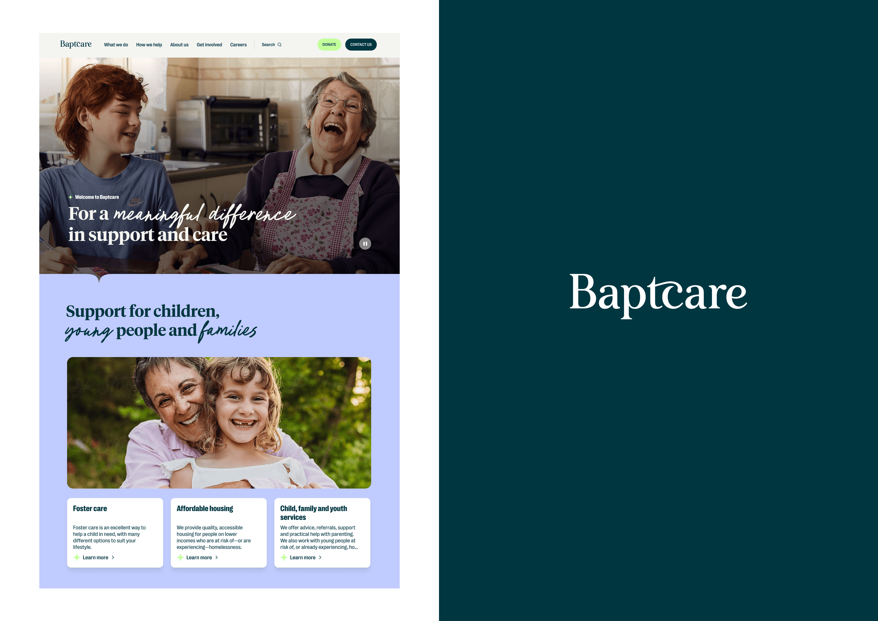
A lasting partnership built on trust and compounding value.
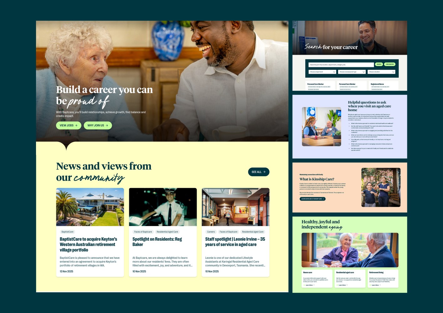
Baptcare is a purpose-driven organisation offering vital support services to people of all cultures, beliefs, and circumstances. The team delivers world-leading care for more than 13,000 people in residential aged care, retirement living, in-home care, family and children services, affordable housing, support for people living with mental ill-health, and disability services. Working in close collaboration with Baptcare, we revitalised their brand aesthetic — maintaining key pillars of their established identity while modernising its look and feel — and designed and built their full website, with comprehensive content development requirements and complex service architecture.
3 × Silver winner at the 2025 International W3 Awards.
This is our most comprehensive, fully supported solution, delivering a sustainable and ongoing customer experience transformation.
Rebrand projects can be costly, time-intensive, and take years to realise commercial benefit—not here. This approach is designed to completely mitigate those risks and deliver a rapid, premium uplift to your entire digital customer experience. A fully-dedicated, co-located August team will take complete accountability for defining, implementing and creating the new Jewish Care Victoria brand and website, and deliver sustainable frameworks for the ongoing implementation of exceptional marketing and customer engagement. If you want it done at exceptional quality, exceptionally quickly, and with all the effort and risk taken off your plate, this is the pathway.
You'll have your own multidisciplinary, award-winning team of brand strategy, design, content, development, and performance marketing specialists.
Full brand development and implementation, with practical guardrails and capability long-term.
Full website development, built in accordance with August's award-winning delivery standards.
Full security and performance package.
(These deliverables would come through a complimentary ‘Yes Service’.)
Additional on-demand support beyond launch.
A thorough, high-quality brand and website uplift, enabling a fast, strategic, and commercially impactful market launch.
This pathway involves a dedicated August team delivering an exceptional Jewish Care Victoria brand and website concurrently, to unlock a strategically aligned, rapid, and impactful uplift. This will empower you to go to market quickly, purposefully, and with genuine commercial benefit. This pathway offers the structure, oversight, and expertise to move with confidence, while ensuring strategy, design, content, platforms, and customer experience evolve together.
The result is a contemporary brand that connects and compels people to engage with Jewish Care Victoria, and a best-in-class website that delivers the support and customer experience that converts.
Full brand development and implementation, with practical guardrails and capability long-term.
Full website development, built in accordance with August's award-winning delivery standards.
Delivery of a best-in-class website.
This pathway involves August taking ownership of the delivery of the new Jewish Care Victoria website. The work will be delivered in line with our proven, award-winning discovery, delivery methodology, and stakeholder engagement processes. The result is a world-class website and digital customer experience—built on robust foundations of insight, evidence, and strategy—with the architecture and scalability to grow with Jewish Care Victoria's ambition.
The site will compellingly convey Jewish Care Victoria's value propositions, connect with customers, and support the ongoing brand evolution at play.
Full website development, built in accordance with August's award-winning delivery standards.

Managing Partner
As a founder of August, Daniel brings over 20 years of strategic leadership experience, with expertise in business strategy, psychology, experience design, pricing, and organisational development. Whether consulting, coaching, or collaborating, Daniel is most driven to see others win.
Daniel’s approach has delivered long-term, compounding success with Guide Dogs, A&L Windows, Corinthian Doors, Mercy Health, Baptcare, St Vincent de Paul Society, and more.

Senior Designer
Zoë brings more than 15 years’ experience across research, design, strategy and product, connecting user insight with big-picture thinking. She excels at bridging disciplines to create intuitive, human-centred digital experiences that consider both immediate needs and broader societal impact.
Zoë has led major design initiatives at Atticus, The Conversation, The Wilderness Society, and across a wide range of technology and environmental projects.

Team Lead
Emma is a strategic leader who partners with organisations to solve complex challenges, align teams, and create meaningful, measurable impact. With experience spanning corporate affairs, marketing, communications, ESG, and business operations, she brings a commercial mindset together with a deep understanding of people, purpose, and growth.
Known for building trusted relationships and bringing clarity to complexity, Emma works alongside clients to shape strategy, lead transformation, and deliver practical outcomes that create lasting value. Thoughtful, collaborative, and outcomes-focused, she helps organisations move confidently from ambition to action.

Technical Director
Matt is a senior technical leader who architected much of August’s engineering approach, combining strategic perspective with hands-on problem solving. A founding member of August, his strength lies in designing scalable, progressive systems that balance robust technical integrity with exceptional experience.
Pragmatic, composed, and deeply trusted by teams and stakeholders alike, Matt ensures every solution is built to last and perform at the highest level.

Senior Content Strategist
Elliott is a seasoned content strategist who turns complex ideas into clear, compelling narratives that move people to act. With deep experience across UX writing, information architecture, and research, he brings a rare blend of creativity and analytical thinking to every project. Thoughtful, collaborative, and calm under pressure, Elliott ensures every word, message, and story is crafted with intent and impact.

Senior Interaction Engineer
Timocles Copland is an accomplished Front-End Developer. Specializing in semantic HTML, modern CSS, and accessible JavaScript, he translates complex system requirements into intuitive, high-performance web applications. His technical agility and agency experience allow him to bridge the gap between technical backend structures and user-centric interfaces. Timocles thrives in collaborative, agile environments, consistently delivering robust, accessible, and highly scalable digital solutions.

Senior Strategist + Analyst
With a penchant for finding the truth in numbers, Mike’s work at August is imperative in proving efficacy. Mike helps establish and set measurable KPIs and benchmarks for clients in short-, medium-, and long-term settings. He also works with clients to determine measurement strategies and tactics that can be implemented with the team at the start of a project or service to ensure future progress is evidence-led. Mike works closely with a range of clients at August to help drive growth, optimisation, and provide valuable insights that reflect customer behaviour.

General Manager
With a background in law, marketing, and people, Sarah started her career in the arts before moving into marketing, technology, and legal tech. Sarah has a particular interest in understanding how people with different educational backgrounds and skills work together to create high-performing multidisciplinary teams. Her work at August involves a mix of high-performance coaching and contributing to the leadership of the organisation.
Sarah regularly speaks on digital and technology topics on ABC Radio National. She is a guest lecturer at Swinburne University and has given a range of conference presentations at events, including Mumbrella 360, ALTACon, the Centre for Legal Innovation Summit, LETRA Legal Training, and a range of digital and marketing events.

Developer Operations Engineer
Vinh connects systems and treats infrastructure holistically rather than as a set of parts. Operating across DevOps, site reliability, and IT administration, he keeps August’s hosting infrastructure secure and reliable. Methodical, resourceful, and steady under pressure, he ensures the foundations are sound, so that everything built on top performs exceptionally well. Previously a physiotherapist, Vinh’s craft lies in the surprisingly large overlap between optimising performance in a person and in a webserver.
While other vendors might happily push something they have a vested interest in selling, we prefer to advocate for the right solution for Jewish Care Victoria based on your unique needs.
We are proficient with many tools and we advocate for choosing the right one for the job, not simply the product we have a license or existing affiliation with.
An experienced partner will collaborate to establish a thorough understanding of Jewish Care Victoria’s context, objectives, and long-term strategic ambitions. Then, select the optimum technology solution based on those current and prospective requirements. This is the best way to build for longevity and protect against repeating the same procurement process in the future.
We note your requirements, preferences, and objectives in selecting a CMS, and that it must:
While we acknowledge these high-level requirements, we have not yet identified a CMS recommendation. There is risk associated with recommending a product without first validating how it will be used, what will make it effective, and other strategic organisational considerations, both short and long-term. These should be discussed in collaboration with Jewish Care Victoria’s key stakeholders.
To provide context and reassurance around our capability, here are some of the criteria and considerations we would assess throughout the process. We would relish the opportunity to discuss these with you in further detail.
A willingness to propose a product without fully understanding Jewish Care Victoria’s operational realities should provoke caution. Some vendors push for certain products simply because they’ve purchased expensive licenses and hope to recoup costs; when you invest in an expensive hammer, everything looks like a nail.
For many reasons, selecting a CMS with a large, established market share is important. A broader developer support base reduces Jewish Care Victoria’s risk of lock-in. Concurrently, this provides a greater range of options when considering new functionality thanks to established ecosystems of plug-ins and features. From an administrator perspective, greater market share and platform ubiquity—particularly a factor with systems like WordPress, Craft CMS, and Drupal—mean new staff are more likely to be familiar with open-source admin interfaces. This ensures that Jewish Care Victoria maintains a high rate of productivity and continuity in the event of staff turnover, while equally minimising time spent onboarding new team members. The frequency of security assessment and associated patch releases ensure a robust, secure site.
Inclusive design is crucial, especially for an aged care and disability service provider. A high proportion of older Australians will use the Jewish Care Victoria site. People with different preferences and abilities will use the site, often with assistive technologies like screen readers. August has comprehensive and proven experience in building highly accessible experiences, with clients like Guide Dogs leading the way as a global benchmark for accessible design.
In selecting and implementing content management systems, we make no assumptions about the technical proficiency of marketing or administrative teams. The right system should simplify site administration for every team and stakeholder without relying on development resources. You must act quickly and spin up new landing pages or digital campaign assets to capitalise on evolving opportunities in a competitive aged and community care sector. At the same time, you need control and appropriate system governance. You cannot afford to be hampered by clunky technology, cumbersome interfaces, or confusing approval processes.
August has extensive experience with a range of system integrations. Project examples include:
Regardless of Jewish Care Victoria’s platform requirements—noting the potential for existing platforms such as Raiser’s Edge, Mailchimp, Klaviyo, Google Analytics, and Meta advertising tools—we are confident in delivering a robust, secure integration that provides a compelling experience for the end-user while making the most of supporting systems. Any number of forms or third-party platforms can be integrated to ensure leads are delivered to the right place, maximising conversions while minimising the risks associated with handling confidential or personally identifiable information (PII) from customers. This ensures compliance with security best practices.
Additionally, several simpler integrations—for example, email signup via MailChimp, Google Analytics tracking, and more—can and will be considered throughout planning and delivery to ensure Jewish Care Victoria maximise the impact of all available platforms in your technology ecosystem.
Performance can be difficult to retrofit. Rather than selecting a solution based on its performance attributes, achieving high-calibre performance depends more on the developer during the build to ensure best practices are followed and considered from the outset. Regardless of the chosen CMS, performance is at the forefront of all August builds and is core to every project from the start. Additionally, August focuses on building web applications that use the twelve-factor app methodology to build scalable software to meet evolving performance needs.
At a high level, through the use of a Content Delivery Network, scalable load-balanced application instances, and optimised code caching, we can provide a fast, performant end-user experience with a suitable CMS that will deliver value far beyond your requirements.
This prevents you from being locked into expensive annual licensing or tied to a sole fixed vendor.
Proven, robust integration capability to provide secure donation and lead capture facilities into the site.
Page speed is a confirmed ranking factor for Google’s search results. Our experience working in the aged care sector shows that search marketing visibility is crucial in lead generation. It is vital that Jewish Care Victoria is present and visible at the point of consideration for prospective customers—for example, when a person’s older parent has a fall at home, and they are thrust into navigating the unknown world of aged care services—to establish a healthy pipeline of leads to nurture towards conversion.
We meet modern best practice in development, testing and quality assurance. This includes:
Every site undergoes rigorous testing at every stage. We standardise development, staging and production environments to catch issues early, and we conduct functional, browser, accessibility and performance testing before any release.
Accessibility is core to our collaborations with all clients. We are experienced with features like screen reader compatibility, keyboard navigation, colour contrast, content structure, and myriad other approaches to align with the Web Content Accessibility Guidelines (WCAG).
Frequent check-ins and progress updates give you visibility, reduce risk and ambiguity, and ensure a smooth, iterative delivery with no surprises or “big reveal” moments.
We maintain fully automated deployment pipelines across development, UAT and production. All deployments are logged and attributed, with full code-level transparency and traceability for audit and review.
We have extensive experience with CRM integration for a range of organisations, facilitating lead generation and sophisticated onboarding for healthcare and social services providers. This includes Salesforce, SharePoint, HubSpot, Stripe, and custom and proprietary CRM platforms. We are also building a bespoke CRM in the non-profit sector, supporting ongoing membership and supporter engagement.
Our solutions draw on more than 20 years of open-source expertise across PHP, Node, Python, Craft CMS, WordPress, Symfony, Laravel, React component libraries, and modern AI integrations. This ensures flexibility, longevity, and long-term maintainability.
Security is core to what we do. We implement a robust suite of best-practice security initiatives as part of our normal approach, including SSL encryption, site backups, and compliance with legal requirements around personally identifiable information (PII) and GDPR where relevant.
We build for speed and stability from day one. Your new site will load quickly, perform reliably, and support a streamlined experience for both site visitors and administrators.
How can you be sure you’re selecting the right digital agency? How do you remove that “oh no” moment?
Let’s face it. At some stage in your life, no matter what you do, you’ll experience buyer’s remorse. It’s inevitable. That moment when doubt sets in. The second and third moments when doubt turns to realisation. The realisation that you’ve made the wrong choice.
As time progresses you realise everything points to complete remorse. And now you’re stuck with whatever you have bought.
Doh!
When it comes to evaluating and selecting a digital agency, you can remove some of the guess work. Use your head and your heart. Remove buyer’s remorse and replace it with buyer’s delight.
In my 30 years of experience, I’ve spent time on both sides of the fence. I’ve worked in companies where I was responsible for choosing a digital agency, and now I work for one. So I thought I’d share my top six considerations. Some of these may be obvious but may also strike a chord.
What’s the difference between capability and skills? Most people can use a hammer but not many people can build a house.
Most agencies have skilled individuals with specific expertise across a range of subject matter. But can they come together to get you the best result?
In a constantly changing digital world, it is critical to understand your agency’s full capability. Can an agency solve problems or will they simply bow to the solution you put in front of them?
An agency’s true value comes out through genuine problem solving. You’re paying them for their expertise and capability, not just their skills. You will likely be with your chosen agency for many years to come, so don’t fall for the trap and select them purely on the basis of a sexy creative concept.
You need to probe and investigate and seek proof that they can actually manage all aspects of your digital marketing needs. From business interpretation to strategy. From design to development. And beyond into digital marketing, hosting, security, search, content, support and maintenance. Look for breadth and depth.
A recent Lunar New Year article by Darren Woolley of TrinityP3 talks about a centuries-old Chinese idiom and highlights how old stories can illuminate today’s lessons. His second example – To Hang a Sheep’s Head While Selling Dog Meat – reinforces the need to do your homework to truly understand what you’re getting. It’s worth a read.
As with many industries, in the digital agency world, you generally reap what you sow. That is, you get out what you put in. And I don’t just mean money. Most agencies base their remuneration on resource levels, daily rates and the time it takes to complete a project. Many are building in value-based pricing where possible. The old cliché – ‘you get what you pay for’ – definitely applies.
There are many agencies who provide value well beyond time and materials. There’s no point in screwing an agency down to a point where the margins are so slim that it is not worth the effort for them to work on your business. If an agency is given a decent budget, they’ll go the extra mile for you. You want them on your side batting for you every day.
Another Chinese idiom in Darren’s article highlights the fact that you are better off focusing on what you want to achieve rather than penny-pinching. The title perfectly reflects my point. At the end of the day – ‘wool comes from the sheep’s back’.
It’s up to you to provide enough room in the budget and to invest in the relationship to get the best possible outcome. You need to invest time, money and effort. It’s a two-way street. So take the time to understand how they charge for their services and strike the right balance between value for money, the best price and getting the right outcome. After all, isn’t that what’s most important? To get the right outcome.
Would you hire a graduate and pay them like an MD just because they were an A-grade student? Of course not. So, why would you select an inexperienced digital agency based on pretty pictures and an untested creative idea?
You need to choose an agency for business reasons first and foremost. It is crucial to ask the following questions:
Striking the right balance between strategy, creative and execution is critical. Adopting an approach of flexibility and iteration has become increasingly important in today’s ever-changing world.
Strategy is not linear. It should be seen as cyclical. Your agency needs to be able to support you when things change. But, the best strategy in the world is useless unless it is well executed. Focus on the ‘why’ as well as the ‘how’ and it will stand you in good stead.
Although a little long in the tooth now, an MIT Sloan Management Review article written by Donald N Sull in 2007 still resonates with me. Closing the gap between strategy and execution reinforces the need to strike the right balance and adopt a flexible, iterative approach. Sull applies the concept to business, but I think this iterative approach is even more relevant to digital marketers in 2015.
Values are at the heart of any business. Values drive culture and have a massive impact on how businesses treat their staff, clients and suppliers. If there is a misalignment of values between you and your agency, you are probably doomed from the start.
A leading UK organisation, CIPD, which specialises in HR and people development, published a report last year about the value in keeping culture, purpose and values at the heart of your SME. CIPD put it very simply and define culture as “the way we do things round here”. If there is a miss-match between the way your agency does things and the way your business does things, then you could be in for a difficult time.
Most agencies are genuine; filled with enthusiasm, creativity, energy and good intention.
Ask them what they value. If they spin you a story around ‘award-winning’ work or even worse, ‘bleeding-edge’ solutions – run!
However, if they can genuinely explain how their attitudes and behaviours get better outcomes, then you’re on a winner. Cultural alignment counts.
It’s great meeting all the wonderful people across the agency. Agency founders. Technical directors. Strategy leaders. Head of design. Content guru. Captain analytics. All are skilled and capable individuals.
But if your account manager doesn’t cut the mustard, you’re on a hiding to nowhere. This role is critical. They become the internal advocate for your business.
Your account manager needs credibility inside the agency and among their peers. You need to be confident that this person can work with you every day and ‘have your back’.
A recent blog post from a coaching forum, inCredible Messages, talks about how important it is to develop credibility and why you should care. It highlights five elements that lead to credibility:
It positions credibility as a package deal.
I agree. If you apply these measures to your account manager, you can begin to see how important it is to have the right person on your side.
Find out if they are the right ‘fit’. The type of questions you might seek answers to include:
When you meet your account manager, why not interview them as if you were going to hire them. Check them out. At the very least check their LinkedIn profile. If you have concerns then say so. If you are happy, shout it out loud. Believe me, it works in your favour.
It’s important to understand where you fit within an agency’s client hierarchy. Think about your own organisation for a moment. Not all clients are created equal. It’s sad but true. There’s a natural pecking order. It may not be discussed openly but it is a reality.
Squeaky wheels and big budgets generally prevail. But money isn’t everything.
Agencies may also value projects and clients that provide value in other ways apart from revenue. Things that may help an agency to grow. They could be show-case or ‘stretch’ projects, or projects that simply add to an agency’s ability to engage with community.
Understanding an agency’s client list and exactly where you fit within the spectrum will provide you with a perspective on how important your business is to the agency. It also provides insight into the level of service you can expect.
If you’re unsure, just ask, then listen to their response. You may be pleasantly surprised.
…and
Here’s one more bonus tip for you. Perhaps it should even be the first thing you do. It’s the most obvious but it’s often the one that’s left to the end or left out all-together, maybe because you’ve been wooed and you’re falling in love. But love, they say, can be blind.
The reference process you adopt is extremely insightful and valuable. Don’t be backward in coming forward. You have every right to ask an agency for references to prove their credentials and verify whether their pre-sales story matches their modus operandi.
We all know that the best predictor of future behaviour is past behaviour. This article in Psychology Today simply reminds us that this adage applies time and again. So why not do your homework?
Take the time to determine whether you have the right ‘fit’. Play your cards right and one day you may be the reference.
“Choose wisely, young Skywalker.”
Do you have any others suggestions for selecting the right digital agency and removing buyer’s remorse? We’d love to hear your experiences and thoughts. Good luck.
Seven proven techniques to drive greater value from your digital fundraising campaigns.
Many not-for-profit organisations are conscious of generating the highest possible return on fundraising and marketing budgets. And rightly so.
Firstly, those budgets often come from hard-earned donation revenue.
I don’t use the term ‘hard-earned’ lightly. The not-for-profit sector is incredibly competitive—with over 66,000 registered charities competing for donor dollars in Australia—and fundraising can be difficult.
Secondly, there’s a strong public expectation that not-for-profit organisations always use any funds in the most efficient way possible.
In their research report Understanding Australian givers to maximise the impact of not-for-profit organisations, McCrindle research agency notes that: ‘for 70% of givers, keeping marketing and administrative costs low (below 20%) matters more to them than [seeing an organisation] grow overall donation revenue.’ To foster trust and credibility among your supporter base, it’s crucial you run efficient, highly effective campaigns that consistently deliver maximum value.
There’s also a simple sustainability equation to consider. It’s inherently problematic if your digital fundraising activity costs more to implement than it generates in donation revenue, and a clear sign that something needs to change.
If you ever find yourself in that boat, here are seven proven techniques that will drive greater value from your digital fundraising campaigns.
First up, it’s crucial to note that third-party cookies—a long-favoured approach for tracking website visitation and behaviour—are being phased out.
As data privacy becomes more prevalent as a serious public concern, third-party cookies have come under enormous scrutiny. Now, many of the larger tech heavyweights, like Google, Apple and Mozilla, are phasing out support.
This has wider implications you can read about here.
In the first instance though, now is the time to start thinking about first-party tracking solutions like Facebook’s Conversion API or server-side analytics.
Why? To run a successful digital fundraising campaign, it’s crucial you draw on clear and comprehensive data that your advertising platforms can self-optimise for.
The settings for each channel in your campaign should be configured to optimise for specific types of conversions. This approach recognises the distinct function of various channels within a prospect’s overall journey towards donating.
For example, almost all paid search activity should be optimised for a donation as the conversion. This is because paid search, as a channel, is about facilitation of intent.
Paid search is typically designed to connect with:
The same logic doesn’t apply to a platform like paid social, because it’s far rarer to see donations come directly through that channel. Here, it’s better to optimise for clicks or engagement with a view to remarketing, because social is about building awareness and interest in your organisation’s mission. Establishing an initial connection, with a view to a future conversion.
Remember, if you run fundraising campaigns through Meta ads, Google ads or a similar platform, it’s crucial to pass conversion data back into that platform.
Why? Many digital advertising platforms feature self-optimising ad serving mechanisms. If you configure these platforms with a clear definition of your goal and a series of variables to test (like ad creative, audience, placement, and many others) the platform will automatically refine the configuration most likely to deliver on your goal. To make the most of this feature, you need to set things up correctly from the start.
A good campaign is rarely a set-and-forget proposition.
Imagine you’re running a fundraising campaign to coincide with the end of financial year. This is a common—and often highly fruitful—initiative for organisations with Deductible Gift Recipient (DGR) status.
Your objectives should change over the course of a two-month campaign. As a result, so should your approach to campaign management.
Early stages of the campaign will likely focus on generating reach and awareness. You may test multiple audience segments to get a sense for traction; you might experiment with different stages of remarketing across different channels.
You may begin to see large volumes of traffic arrive to your site as a result of early activity to drive awareness. This is especially common with social advertising. You could use this traffic to build a remarketing list for another platform like Google Ads, ensuring that people will continue to see additional campaign imagery and messaging on other platforms like YouTube, Gmail, or display advertising.
This approach turns traffic which may not necessarily result in a first-time conversion into a potential future source of value.
Over time, the drive for donations should become more explicit, and remarketing can help in this capacity. As the campaign continues and you move closer to June 30, more people will donate. So it’s crucial that you stay top of mind and connect with people multiple times throughout the consideration phase as things ramp up.
The rule of seven—a classic idea in old and new school marketing—suggests people should be exposed to marketing messages seven times in order to trigger a behavioural change.
Remarketing ensures your campaign message will connect with warm prospects multiple times.
Coined by American psychologist Edward Thorndike, the halo effect (sometimes known as the halo error) is a form of cognitive bias. It refers to the tendency for positive impressions of one commodity to positively or negatively influence feelings towards other commodities.
For example, if paid search is delivering a 22% conversion rate and paid social is delivering a 0.08% conversion rate, the halo effect may lead us to mistakenly conclude the channel with the lower conversion rate is redundant.
It’s important to acknowledge that no channel exists in a vacuum in the context of a fundraising campaign. Equally, attribution is rarely an exact science.
Sometimes, a certain channel or tactic may appear to underperform when compared with the superficial return-on-investment of another. Before making any snap judgement, it’s crucial to test whether that channel is playing an important function higher in the conversion funnel.
How might we test the importance of different traffic sources or channels? There are a couple of options, each with benefits and drawbacks.
Multi-channel attribution
This involves looking back across the traffic source for donors who visited the site multiple times before donating to see which channels were part of the journey.
However, the reliability of this data can be questionable. It’s challenging to track the same person across multiple devices, and the degradation of third-party cookies makes it hard to track users over time. Use of first-party tracking will make this type of reporting much more reliable in future.
Comparative analysis of previous campaigns
Another option is to look at the archive of campaigns your organisation has run previously. If last year’s Christmas campaign was run with a significant paid social effort, and another Christmas campaign was run with little-to-no paid social, the comparison could give you insight into paid social’s likely impact on bottom line.
However, this analysis is indicative only, and subject to a wide variety of uncontrolled variables, both internal and external.
For those that qualify, Google’s Ad Grants program is effectively a free addition to your budget.
It provides up to $13,000AUD per month in search advertising shown on Google, and the application process is straightforward and relatively quick to complete.
To meet the eligibility requirements, your organisation must:
Additional criteria stipulate that:
While Google Grants can be a powerful supplement to your marketing budgets, it’s worth acknowledging that the program comes with certain constraints and limitations.
Google Grants are highly unlikely to perform in a competitive space, where multiple organisations are bidding on keywords that are not inherently tied to a single brand. ‘Animal charity donation’ is going to be contested by a wide range of charities, so Grants likely won’t have the desired impact. A term like ‘guide dogs Australia donation’ is less likely to be competitive, making Grants a more viable option.
Google Grants are also limited in terms of targeting and format. You can only run paid search through a Grant account, for example.
Most Grants shortcomings can be offset through paid advertising, so the ideal solution is to have both running in conjunction. The key thing is learning to distinguish when and how to use each of them, and how they can best work together.
Two tactics to try here include:
Microsoft Ads run on Bing, the default browser installed on every PC device. As an observation, many people over 50 will buy PC devices (given most people this age were introduced to using computers prior to the Mac revolution) and rarely replace the default browser.
This age group is also a highly valuable donor bracket (for both conversion rate and average value of donation).
Plus, Bing is—generally speaking—less competitive than Google Ads. It’s a smaller search engine in terms of user base, but it punches well above its weight when comparing fundraising advertising options.
For a potentially lower investment, you can connect with a highly valuable donor demographic and deliver a significant windfall.
This sounds obvious, but it can represent an untapped goldmine.
Sometimes, when you’re so focused on specific campaign objectives, you can miss the forest for the trees. Or, focus so intently on engaging new supporters and nourishing them on the path to conversion that you neglect to optimise for the highest donation possible.
A/B testing becomes particularly important in this approach.
In A/B testing, you compare two versions of the same landing page (or donation form) over a period of time to determine which delivers more value.
There are many different things you can augment or optimise to invite a higher donation amount. You could:
So, there you have it, seven techniques to help you get more value from fundraising campaigns.
If you’d like help implementing any of the above—or running a donation or advocacy campaign in general—give me a call or flick through a contact message.
There’s nothing I find more interesting and rewarding than supporting not-for-profit organisations to achieve their mission.
This supposedly tiny consideration can have a significant impact on your marketing goals — here’s how a little bit of craft goes a long way.
Marketing teams in not-for-profits have a huge remit.
If you’re in design and content production, your interest is likely divided across:
To make things more complicated, you may be creating all of these content types in a single day, with shifting deadlines, priorities and approvals processes.
So, it’s completely understandable that a seemingly minor consideration—something like writing microcopy—can fall by the wayside.
But the thing is, this supposedly tiny consideration can have a significant impact on contributing to your marketing goals.
How significant, you ask? This example highlights that a simple change in phrasing from ‘Request a quote’ to ‘Request pricing’ saw a 161.66% increase in clicks.
There’s research from Nielsen Norman Group that suggests well-structured website copy contributes to 124% better results in supporting people to achieve their goals.
The evidence is clear: when it comes to microcopy, a little bit of craft goes a long way.
According to this excellent overview from Anja Wedberg at UX Writing Hub, microcopy is: ‘the small text snippets that guide us through websites, apps, and other digital experiences. It comes in many shapes and forms, but it has a common goal: to help people navigate through a digital product or service as smoothly as possible.’
I’d add to that definition by suggesting microcopy always serves a functional purpose.
Unlike editorial copy (which is designed to articulate an idea or perspective on an issue), or branding copy (which intends to elicit an emotional response in relation to a product, service or concept), microcopy is all about supporting people—or getting people—to do something.
Microcopy comes in the form of:
In each of these applications, there are specific techniques non-profit organisations can use to increase the likelihood someone will complete a desired action; whether it’s to donate, sign-up to a mailing list, volunteer, support a petition, or anything else.
Why? Well, it’s called a ‘call-to-action’ for a reason. You’re trying to incentivise someone to act.
Most people who visit your site or view your collateral—whether they’re long-term established advocates or newly discovering your mission—will feel some level of personal association with your cause. That’s why they’re reading your content.
By using passionate action-oriented language, you will either:
When you write conversion-focused microcopy, always start your CTA with a verb. This makes it clear what action the person triggers by clicking the button.
As an additional tip, provide some compelling pre-text in close proximity to the CTA. Like this example below, from Sea Shepherd.
Sea Shepherd’s ‘no fishing’ campaign website features some compelling microcopy.
The pre-text is particularly compelling here because it subtly positions the reader as being the central actor in creating change. By simply clicking the button, you become the hero of this story.
‘If nothing is done, there won’t be anything left’. Psychologically, there’s an unspoken implication: those who don’t ‘take action’ are comfortable doing nothing, and complicit in the slide towards a future where there’s nothing left.
So, will you do nothing? Or will you click the button?
This leads perfectly to the next technique…
Why? As a non-profit, your mission is crucial. It’s how supporters connect and align themselves with your organisation.
Your story is your secret weapon: you should find opportunities to reiterate your mission in every facet of your website. This will reassure your supporters of why they’re here and highlight their importance in facilitating crucial impact.
It doesn’t have to be overt or overdone. A simple nod is enough.
For example, research suggests many of Guide Dogs’ donors are motivated to support dogs and puppies in training, so the dollar handles in their donation form (see below) reiterate how different contributions provide value for the dogs in different ways.
Beyond microcopy, the animated icons are a nice touch that helps with storytelling, eliciting an emotional response, and driving conversions too.
Animated dollar handles in one of Guide Dogs’ donation forms.
Jai Dog Rescue, an organisation devoted to transforming the lives of street dogs in Thailand, have an ever-present ‘donate’ button that tracks down the right-hand side of their homepage. The microcopy here reiterates the organisation’s valuable work, while perfectly aligning with the likely motivation of most people visiting the site: ‘100% of your donation is spent on what matters most: transforming lives of dogs in need’.
Jai Dog Rescue uses microcopy to reiterate its mission for prospective donors.
The Royal Women’s Hospital includes some incredibly compelling stories in their donation form. These stories not only reiterate the value of your potential contribution, but serve to spark a deeper emotional connection to different causes that may resonate with donors.
Microcopy in the Royal Women’s Hospital’s donation form.
The National Breast Cancer Foundation uses a slight variation on this theme. While there’s no microcopy directly against each dollar value within the donation form, there is supporting material to describe the types of research a donation will fund. The point is there’s a narrative component associated with the function of donating, which connects back to why taking action is important.
The National Breast Cancer Foundation highlighting the impact associated with donations.
Here’s another example from Animals Australia (please note, some people may find imagery in the link distressing). This is a call-to-action encouraging people to send a petition that calls for an end to live export.
Animals Australia uses microcopy to express the core emotional message of the call-to-action.
Rather than simply highlighting the functional intention of this form—‘Sign our petition’—Animals Australia uses microcopy to articulate the ultimate emotional proposition that underpins the action behind the form: ‘Save animals from cruelty’.
This approach connects more with the motivations of the supporter, is far more meaningful to them, and is significantly more likely to drive the desired action.
There’s also this example on a 404-page from Jesuit Social Services. The typical function of a 404-page is to simply indicate there is no corresponding page within the domain of the website you’re on. Basically, you’ve hit a dead end and the page you’re seeking doesn’t exist.
Jesuits Social Services uses its 404-page to tell a story.
Jesuit Social Services use the messaging on its 404-page as an opportunity to reiterate its mission. Through the power of a nicely crafted micro-story, this approach turns a potentially negative experience into a surprise moment of delight: providing a chance for people to learn more about the organisation’s mission and purpose.
Why? This one pertains to accessibility. Specificity of labelling is an important consideration for accessibility, among many other factors.
By labelling buttons and call-to-actions with some clue as to the function of that button—like ‘learn about our services’ rather than simply ‘learn more’—you can provide more context for people with different abilities, like low vision, blindness, or variance in cognitive ability.
This is important; in a hyper-competitive fundraising landscape, your website needs to connect with and support as many people as possible.
As an added bonus, it’s a small thing that can contribute to a feeling of trust and transparency. Also, the more descriptive you are with button labels, the more likely you are to find opportunities to allude to the narrative of your mission (see the above point about small, emotive stories).
Below is another great example from Guide Dogs. Rather than relying on a single general catch-all like ‘see our services’, each of these buttons speaks to a very specific goal or impulse that aligns with the motivation of the visitor. Of course, ‘see all services’ is still there for those that want to see a full list of everything.
Guide Dogs’ CTAs for services speak to different impulses and goals.
On the Critical Danger website, which raises funds and awareness for charities supporting critically endangered animals, minimalistic CTAs are dotted throughout the single page site experience.
Although the CTAs here are small, they find ways to command attention.
Nestled among gorgeous photography and some nicely crafted animations, the CTAs are incredibly specific: ‘Visit the IUCN Red List.’ In addition to the benefits highlighted above, there are elements of education and curiosity at play here too. What is the IUCN list? What animals are on the list? What additional information does the list offer? For such a small CTA in the context of this site, it provides multiple incentives for your click. ‘Read more’ simply doesn’t provide the same value.
Why? There might be multiple steps in eliciting a conversion.
You may have social media ads, paid search, or an eDM campaign that links through to a conversion-focused landing page.
Whatever the steps involved in getting people to your site and encouraging their support, you’ll have a better chance at success by making it as easy, consistent, and clear as possible at every point of the journey.
Without clear signals guiding people toward the next step, you run the risk of drop-offs at each point in the process.
In the examples below, it’s perfectly clear that you’re about to provide support for Animals Australia’s ‘Be their Hero’ campaign as you transition from the eDM to the landing page. There’s clear consistency in the language so you immediately know you’re in the right place and how to contribute after clicking on the email CTA.
The click-through CTA in the email invites readers to ‘Keep ‘Be their Hero’ on TV’…
Before the landing page clearly encourages people to join and support the cause: ‘Yes! I want to help keep this TV ad on air’.
Writing in accordance with these principles will help you craft better microcopy. But the best—and in fact only—way to establish whether it’s ‘good’ or not is to test it.
Remember, microcopy should serve a functional purpose; it should encourage a conversion. With that in mind, we can use A/B testing to hone the efficacy of microcopy in various instances throughout a website or campaign.
In an A/B test, we might write two donation CTAs for Guide Dogs:
We can then send a portion of traffic to one CTA and a portion of traffic to the other, measuring which one has the higher conversion rate. We might establish that 1-in-6 visitors will donate to the first CTA, while 1-in-10 will donate to the second.
You should always continually test and optimise your microcopy based on analytics, to ensure the most impactful approach possible.
If you’ve never thought about microcopy in this level of detail, you could be leaving value on the table. The great news? It’s never too late to write good microcopy. There are simple things you can do right now to capitalise on improved conversions.
There’s plenty more beyond that too.
For the time being though, let’s stay true to the focus of this article: Get the small, simple things right and you’ll start to unlock serious value.
How do you align a room full of competing priorities before a single pixel is built? Context sheets offer a potent, efficient way through.
It’s always exciting being on the cusp of building or redeveloping a website. Opportunity abounds. The potential is limitless. And everyone is brimming with ideas.
Concurrently though, everyone is also brimming with different—sometimes competing—priorities. There are different objectives across disparate teams or business units. There are stakeholders who are crucial to the success of the project, but who may not be overly familiar with what it takes to build an effective website product. Or, equally, how to ask for what they need in order for the site to best serve their interests.
Some people throughout the organisation actually want the same thing but ask for it in different ways. One person’s ‘content hub’ is another person’s ‘interactive digital resource platform’.
Typically, there will be some reference sites thrown into the mix to serve as inspiration; a benchmark for what the new site could or should be. It all looks sleek and polished, and everyone’s excitement levels rise again.
For all the excitement though, there are challenges on the horizon. They can’t be overcome by simply adding everyone’s wish list into a Google doc and pushing forward.
History is littered with cautionary tales highlighting the perils of design by committee.
Take the Pontiac Aztek for example. Built through an intentional process of ‘design by committee’, the Aztek was a commercial disaster for General Motors in the early 2000s. It’s still universally derided as one of the ugliest cars ever produced.
If the project starts now, things will only get more challenging as time rolls on. Any variance between teams and stakeholders will only compound and resonate throughout the delivery of the project. And at this point, there can be significant variance.
First up, it’s worth defining key terminology (pro tip: this is also one of the first things to do when crafting a brief).
What do we mean by ‘multi-stakeholder NFP environment’?
There’s no hard or fast definition, but for the purpose of this piece, let’s talk in the context of a newly federated national charity.
A federated model consists of a single national presence that operates registered, independent local branches. Most national Australian not-for-profits and charities are structured as federations, like Foodbank and Cystic Fibrosis Australia. Many sporting bodies are federated too.
There’s evidence to suggest that thousands of these organisations could benefit from the efficiencies of consolidation.
“In particular the Community Council for Australia and other peak bodies have been calling upon charities to consider merging... in a bid to reduce competition for increasingly limited funding.” – Clarissa Sukkar
Guide Dogs provides a great example of how the members of a federation can work together.
Originally, there were multiple state-based branches with individual brands, teams, and processes: Guide Dogs Queensland, Guide Dogs South Australia, and so on.
Following a unification project, they all moved together to pool resources and leverage efficiencies under a single, cohesive national banner.
Understandably, the website was a crucial part of this process. Five distinct, individual teams—each with their own sites—came together under the one banner.
This inevitably means navigating:
It is absolutely critical to navigate these challenges before you build anything.
And in a not-for-profit environment, where donations and fundraising dollars are hard-earned and government funding can be scrutinised, maximising the value of every dollar is crucial.
‘Context sheets’—a co-design tool run via a workshop format—is an incredibly effective way to align a wide variety of stakeholders throughout your organisation.
Everyone from CEOs to client-facing service providers can, and should, participate. At the very least, there should be a representative from every key stakeholder group affected by the website project. This could be anywhere from five to 25 people; some teams, like Mercy Health, have even run multiple versions of the same workshop with a core group of consistent attendees to accommodate larger stakeholder numbers.
By the end of the facilitated session, which takes far less time than it would for your team to compile and write a brief, all key stakeholders will have a comprehensive understanding and documented outline of the project, with:
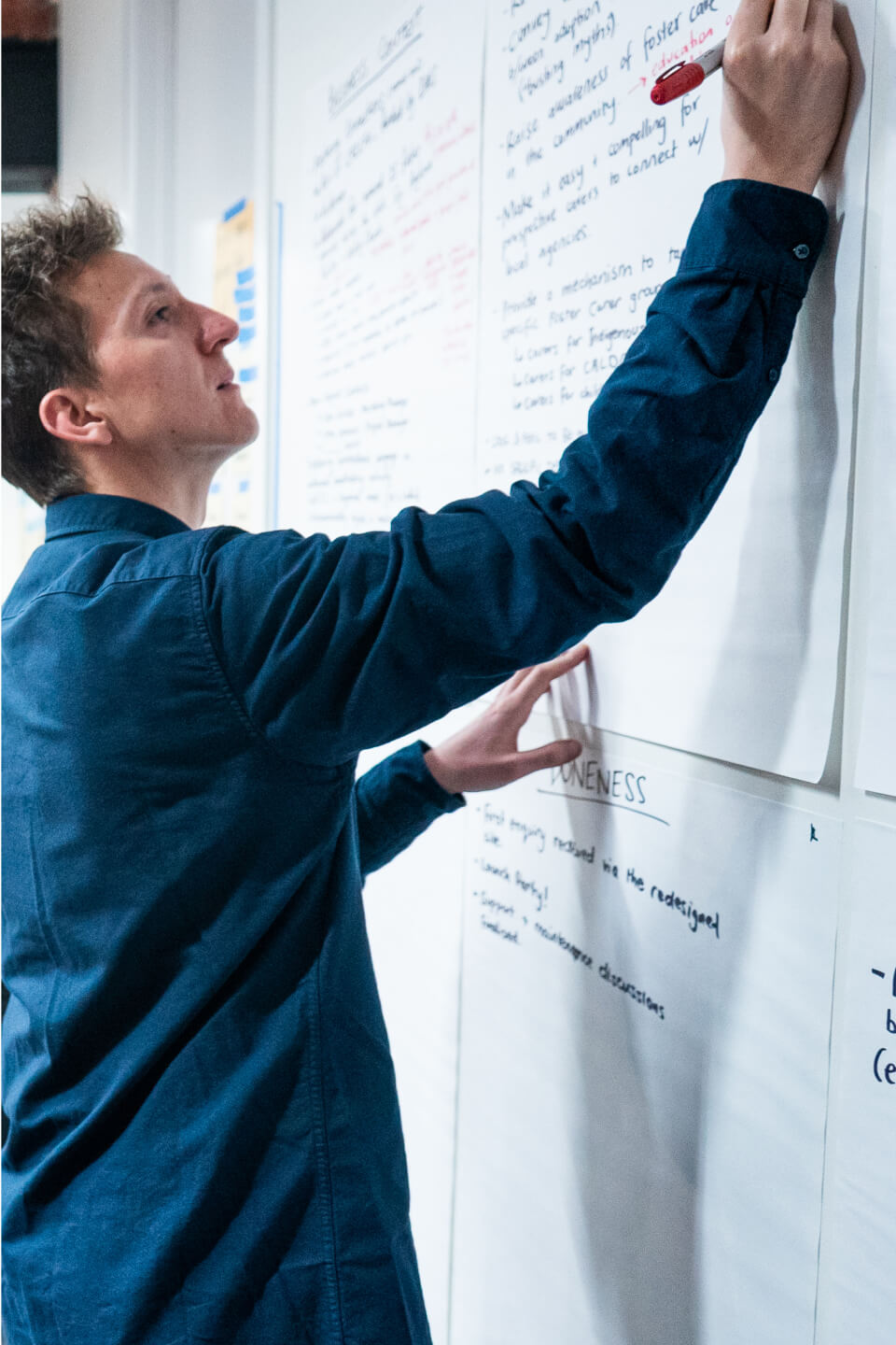
This is all achieved with little more than a room of project stakeholders, eight large sheets of paper, two coloured markers, and an experienced team to facilitate and document the conversations. The process typically takes about three hours.
Here’s what it looks like in action:
This design tool is uniquely designed to ‘flatten the room’. That is, to eliminate the variance in the team’s collective understanding of the project. It is crucial this is done in an open, collaborative forum.
In order to truly flatten the room, context sheets draw on a number of proven techniques to momentarily suspend organisational hierarchies, power dynamics, and other barriers that can impede effective communication and collaboration between multidisciplinary teams.
The experience is predicated on psychological and pedagogical frameworks that help people most accurately process and retain information.
These include:
Why is it so important that we have open, collaborative, and documented conversations to calibrate a shared understanding of the work?
Imagine a scenario. You’re in a traditional briefing session where every attendee writes their own personal notes in reflection of the conversation. Any discrepancy between peoples’ understanding of the project is rarely identified, let alone broached.
What happens when the team members from that session return to their teams, and the discrepancy of understanding echoes throughout the organisation? Confusion abounds. The higher the likelihood of confusion in delivery, the greater the chance for errors, misalignment, and potentially expensive rework.
Conversely, context sheets act as a singular, shared collection of detailed notes that stakeholders validate together.
This is crucial to the success of the brief because it ensures the team will:
The way you construct your brief is absolutely critical to the success of your campaign or website project. At the same time, it’s an incredibly delicate balancing act to navigate.
This is because:
When there’s so much at stake, it’s worth investing in a proven, replicable process. One that’s backed by research and sound evidence base, and has been used to great effect by marketing teams in some of Australia’s largest and most loved non-profits.
Context sheets tick every box.
Beyond consistency and efficiency at scale, design systems deliver organisational benefits that add value far beyond ‘on-the-tools’ implementation.
If you’re considering implementing a design system, you’re likely aware they offer consistency and efficiency at scale.
These benefits are well documented. In fact, they’re often the two key drivers behind the decision to adopt a design system in the first place.
In many cases, teams will implement a design system to formalise the way they approach brand and design language. With the right ingredients, the system will minimise wastage and variance in output when assets are produced by multiple teams at scale.
But it doesn’t end there.
There are many more additional—and perhaps unexpected—organisational benefits that add value far beyond ‘on-the-tools’ implementation.
We’ve likely all experienced similar scenarios.
And then Soph leaves the team.
Without documentation of best practice and brand applications, there’s always the lingering risk of losing intellectual or procedural capital when there are personnel changes in the team.
This is because, without a formalised design system, critical knowledge stays with individual team members.
When you have a design system in place, there is no risk of knowledge staying with a few key people.
To be effective, design systems must be inherently transparent and universally accessible. Some organisations even make their design systems publicly accessible, like Audi.
A design system doesn’t have to be publicly available, but it does need to be freely accessible for everyone in your team. Everyone needs to understand the importance of your guidelines and have quick, easy access to information about design conventions in order to uphold them.
Implemented and maintained appropriately, a design system will ensure more people are empowered with clear, explicit, and descriptive guidelines.
While this significantly lessens the disruption that can arise when key people leave, it also makes it far easier to maintain continuity when new team members arrive.
With descriptive guidelines in place—supported by clear rationale highlighting the importance of those guidelines—there’s no ambiguity about design language or brand application.
As a result, new team members can get up to speed quickly and hit the ground running.
A rising tide lifts all boats.
Providing guidelines for a range of technical considerations like accessibility—which are universally visible to everyone in the team—creates a scenario where more team members are mindful of these considerations in their daily roles.
Shopify’s design system, Polaris, includes an entire section to ensure accessible design and development practice is factored into everything they build.
Similarly, Animals Australia’s design system, called Habitat, includes guidelines for writing alt text for images.
Alt text is an accessibility consideration that describes the appearance or function of images throughout website content. It provides descriptive signals for people using assistive technologies like screen readers (typically people with blindness or low vision), so they can understand the content and intent of imagery.
Being able to highlight common conventions for alt text means more people in the team are likely to understand what it is and why it’s important. And thus, far more likely to implement alt text when creating website content.
Without these shared visible conventions, there’s a greater chance people may not be mindful of alt text at all.
This is a relatively minor example. But when you have many of these techniques and considerations documented throughout the design system (like requirements for optimising images, conventions for interaction and animation styles, grids and spacing for design layout, best-practice tips for creating emails) your teams—and their output—will be infinitely better.
The most senior and experienced minds in your organisation are better deployed on marketing, rather than in marketing.
These team members should spend time doing things like:
Without the right structures or guidelines in place, these senior team members can be caught up in work that is equally important, but less commensurate with their skillset. This includes:
With the right guidelines in place, design systems can do some of this heavy lifting by highlighting best practice via a single source of truth for multiple teams.
They can also provide conceptual rigour that makes feedback less ambiguous. In other words, you can point to an established set of guidelines to determine whether something aligns with the brand.
A noted example of this second point is the six key pillars of Steve Jobs’ design philosophy.
The pillars that Jobs’ used to inform Apple’s design approach were:
By documenting these pillars and making them available for everyone in the team, Jobs inevitably spent less time articulating his vision for the brand and more time delivering it.
These were the known and accepted conventions that defined Apple products. Any proposed design that contravened these principles was unlikely to be approved.
As he didn’t have to continuously provide the same feedback—because the baseline output of the team defaulted to align more closely with his vision—Jobs was freed to work on higher level priorities for Apple.
With the right elements and processes in place, a design system can have significant impact: both for the team who use it daily and the wider organisation as a whole.
Design systems can act as an acute remedy, adding immediate structure, consistency and efficiency to environments that lack formalised design conventions.
But they can also remedy more chronic organisational challenges, by helping to:
Over time, the impact of these two-tier positives can be substantial. If you’re on the cusp of implementing a design system, expect the unexpected benefits.
While building a large audience is crucial, a community can add additional dimensions of value. So what exactly is that value?
If building a sizeable, passionate and committed audience is your only priority, you could be shortchanging your supporters. And denying yourself of value.
That sounds dramatic, but it’s true.
While building a large audience is crucial—for progress towards your mission, for organisational stability, for reach and recruitment of supporters—a community can add additional dimensions of value.
This first begs the question: what is the difference?
There are some important distinctions.
An audience is defined by one-to-many communication. Typically, you project messages outwardly towards your audience, and the members of that audience receive them. A community is defined by many-to-many communication: you might lead a conversation or provide the overarching themes to guide participation, but highly engaged and participatory community members will contribute and generate their own responses.
An audience is receptive. An audience will respond to the content you produce for them. A community is generative: community members will produce content among and for each other. The insights gleaned from this material can even influence the type of messaging or campaigns you produce for your wider audience.
Audiences are largely impersonal in nature; communities are predicated on understanding and connecting with individual people. As an extension of this idea, audiences can be purchased. Communities are based on relationships, and must be earned.
In building and maintaining an audience, it is unlikely your organisational goals or priorities will change. When you foster a community, there are opportunities to pivot organisational goals and priorities in line with feedback or insights gleaned from the community.
Building an audience is a short term and more conservative approach. Building a community is more ambitious: there are risks involved, but the outcomes and value can far exceed your expectations.
So, what exactly is that value?
Here are some examples of the significant benefits that communities can deliver for not-for-profit organisations.
Having a large, established audience is enormously beneficial. But it’s also defined by a top-down communication dynamic.
You create and publish material which your audience will consume. You provide services which your audience can choose whether or not to engage in.
The shift to a community creates a more reciprocal and participatory model. By fostering a community, you can hear directly from your supporters to establish clear insights into:
This exchange—and the learnings you glean—can be explicit or implied.
With an established community in place, you can literally ask for feedback about any of the services you provide.
You could even ask about the way you manage or support the community you’re engaging, like Beyond Blue does in their community forums.
Beyond Blue asks for feedback on how they can better run and maintain their community forums.
Alternatively, if you have the right tracking and data analysis configuration, you can infer feedback from the behaviour of community members over time.
For example, CatchUp—Guide Dogs’ social networking and support platform for people with low vision or blindness—offers a social groups section with conversations about cooking: recipes, tips and techniques, assistive technologies for people to use in the kitchen, and more.
If this is one of the most frequently visited and highly engaged areas of the platform, that might indicate potential groundswell for a training course on cooking classes.
An engaged community provides access to an ‘always-on’ (and always honest) market research channel.
When you have access to an engaged and forthcoming community, you can be more engaged and proactive in the way you support your entire supporter base.
This benefit is specific to a certain type of not-for-profit organisation. Communities are especially valuable for support services and community health providers like Cancer Council, Guide Dogs, ReachOut, or Lifeline.
For people navigating the challenges associated with grief, anxiety, depression, or a difficult diagnosis with their physical health, empathetic peer-to-peer exchanges can offer invaluable support.
Research suggests people are increasingly comfortable turning to online communities to seek help with loneliness, isolation, anxiety, and more. Moreover, people experiencing serious mental health challenges report benefits from interacting with peers online.
By engaging with and learning from peers online, people can gain important insight into healthcare decisions. Over time, this can contribute to more confidence and comfort with in-person service seeking behaviour.
A supportive online community can act as an important long-term conduit for people who may never have otherwise sought to engage a service provider.
There are two benefits here:
Brand salience is a concept developed by Professor Jenni Romaniuk and Professor Byron Sharp, both acclaimed authors and Directors at the Ehrenberg-Bass Institute of Marketing Science.
It refers to ‘the propensity of a brand to be thought of in a buying situation, reflected in the quantity and quality of the network of brand information in a person’s memory, or the brand’s share of mind.’
When you commit to build a community, members will likely come from two main sources:
1. Existing members of your audience—who are likely already passionate advocates for your organisation—join and support the community simply because it is your initiative.
2. Entirely new members come to the community for the content generated by the community, drawn to the value of peer-to-peer engagement with people who share their perspectives or circumstances.
For people who fall into this second category, your organisation is merely seen as a facilitator for the community. In this case, any consideration of brand is likely a secondary proposition.
Over time however, this dynamic will shift. As the shift occurs, brand salience becomes an important and valuable factor.
Consider a hypothetical scenario.
A young woman, Laura, struggles with the pressures of her final year at high school. Without fully understanding the nature or reason why she feels a certain way, she Googles some of the feelings she’s experiencing and discovers a community forum. It’s run by an organisation called PositiveMindSupport.
As Laura reads through the forums and begins to contribute to discussions, peer experts offer support, techniques to help manage her challenges, and suggest the value of speaking to a qualified support person. Laura is hesitant about reaching out for in-person support, but learns a huge amount from the community and manages to successfully navigate her final exams.
Years later, an unexpected death in the family re-triggers the same difficult feelings. This time, Laura is more open to the prospect of in-person support.
The concept of brand salience suggests a higher likelihood that Laura will reach out to PositiveMindSupport for in-person support, based on this organisation occupying a higher share of memory compared to other competing providers.
Now, consider that Laura is just one visitor to a community with 40,000 members. When people derive valuable support from a community, there’s a residual positive connection made with the facilitator of that community. Over time—and at scale—this can result in your organisation connecting with more people to provide valuable support services for far greater benefit.
While growing your audience is important, communities can offer compelling new benefits in both the short and long term. And both for community members and facilitators alike.
Building a community is a potent way to foster and engage your existing supporters in new ways, to differentiate yourself from any comparator organisations, and to build valuable new connections.
So, what are you waiting for? Let’s build one.
How do you connect with such variable audiences and accommodate each person’s distinctive needs? Here are some proven techniques to consider.
Australia is home to incredibly diverse communities. Together, we come from all kinds of backgrounds and contexts.
Equally, we all have different circumstances, with varying needs and requirements for support. 30% of our population was born overseas and 22% speak a language other than English at home. One in six Australians live with a disability, with around 519,000 people on the National Disability Insurance Scheme. 5.1 million people receive some form of income support. 44% of people aged 18-65 in Australia will experience a mental health challenge or disorder at some point in their life.
Social services providers play a key role in supporting people with different contexts to navigate important social, economic, and health-related issues. And while our collective diversity is something to celebrate, it can also create challenges—and opportunities—for marketers.
How do you connect with such variable audiences and accommodate each person’s distinctive needs or preferences? How do you articulate what you do, when many social services providers are many things to many groups and people?
Here are some proven techniques to consider, honed through working with a range of organisations from the social services sector.
In order to connect with and support your audiences, you need to be readily available when—and how—they look for you. This means catering to some potential variance in how people are likely to articulate your services, or the search intent they will use to try to find the right support.
While the terminology and language that many organisations use is always appropriately person-centred, aligning with best practice, the general public may not be as progressive or considered when searching for help. Especially if they are in some state of distress.
For example, while a service provider might say ‘support services for people experiencing homelessness’, a person who is actively looking for help might write ‘services for homeless people’ or simply ‘homeless support’.
This phenomenon is also relevant for terminology with things like funding reforms. In 2013, when the Australian Government introduced Home Care Packages for aged care services, there may have been a period where people still searched for legacy terminology, like ‘Community Aged Care Program’.
To overcome this variance and connect with people at the critical moment, you might run search ads that bid on a variety of terms. This will ensure your organisation is present on a search result page regardless of the language people use.
It’s important to ensure that any content page tied to a paid search ad closely and immediately aligns with the intent behind the searcher’s query. If it’s not immediately self-evident that people are in the right place, you’ll see a high bounce rate (whereby people land on the page and leave immediately without any meaningful interaction). Google’s ranking algorithm is also likely to determine your content doesn’t directly respond to the intent, you’ll get a low quality rating in its system, and your ad will be made less visible.
Social services providers offer support for all kinds of people from diverse and multicultural communities.
In order to be effective, website and marketing content needs to:
A polyformat approach to content can deliver against all of these objectives. For example, in its ‘Communication Guide to integrating culturally, ethnically, and linguistically diverse communities in rapid responses to public health crises’, the Migration Council of Australia—the national settlement peak body that supports better settlement outcomes for Australia’s migrants and refugees—highlights that ‘images, animations and videos increase understanding of healthcare information for people in CALD user groups. This is enhanced when those images are culturally sensitive and include representation of individuals and communities from their background’.
Aligning with this approach doesn’t necessarily require an enormous investment into content production. There are small considerations and techniques you can implement that accumulatively contribute to accessible experiences for people from CALD groups.
For example, Jesuit Social Services features illustrations of people from various community groups in the visual language of its design system.
Some of the illustrations featured throughout the Jesuit Social Services website.
The website’s navigation features visual icons to provide helpful cues to guide people towards the right information.
The website’s navigation features visual iconography to help people understand support service offerings and how they may be relevant for different needs or communities.
And, the site offers content in multiple languages—including Arabic, Oromo, Somali, Tigrinya, Tibetan and Vietnamese—and caters to both non-Roman alphabets and right-to-left scripts.
This means taking an inclusive approach to the people and communities who are represented in your marketing imagery. Diverse media representation is beneficial on multiple levels.
Firstly, from a service access perspective, including imagery of culturally and linguistically diverse communities helps people to ‘see themselves in services’. This can make it easier and more efficient for someone to validate that a support service is relevant to their needs and can equally help in overcoming any challenges associated with language or literacy.
There is evidence that people prefer pictures in health messages that are culturally sensitive and include representations of people like themselves. This study suggests people are more likely to notice these messages, increasing the likelihood that people will engage with the service when it is needed.
At the same time, equitable representation contributes to a higher societal benefit: positive media representation can be helpful in increasing self-esteem for people of marginalized groups, and especially young people.
Intergroup Contact Theory—developed in the 1950s by Dr. Gordon Allport—suggests the more exposure or contact people have with groups who are different to themselves, the higher the likelihood of acceptance of that group. It is hailed as one of the most studied and successful prejudice reduction strategies in the social sciences. ‘Mediated contact’, as an extension of the original Intergroup Contact Theory, is proven to create positive effects on both explicit and implicit attitudes and improves intergroup relations in a range of ways.
In other words, according to research, inclusive imagery, video, and marketing materials contribute to a more inclusive society overall in the longer term. While it’s a gradual process, anything we can do to reduce inequality, discrimination and marginalisation is worth pursuing.
Many social services organisations have unique terminologies or shorthand references for concepts. The key here is to ensure that any internal language remains exactly that: internal only.
Any information or descriptions of services should be written in plain language to ensure the material is as clear as possible.
A helpful technique to remember here is the ‘outside-in’ approach. Rather than approach content from the perspective of someone in your organisation (inside-out), adopt the perspective of someone encountering these topics and concepts for the very first time (outside-in).
Guide Dogs uses accessible terminology to articulate services in a way that supports people accessing them for the first time, and that does not require any clinical literacy to understand the benefit of what’s involved.
In addition to ‘Orientation & Mobility Services’, Guide Dogs includes qualifying content to accessibly describe the service: ‘practical skills to get you or your child where you’re going with confidence’.
Guide Dogs ensures its services are described in a way that makes sense to people discovering them for the first time.
Jesuit Social Services employs a similar technique. Many of the organisation’s programs and support services are accessed via referrers—and many are well known in certain areas of practice—so the ‘technical’ or organisational name of each service takes precedence. However, as some services can equally be accessed via self-referral, there’s also a qualifying statement to describe each program in a way that a person looking for support can understand. For example: ‘Connexions’ includes the secondary descriptor ‘support for young people with mental health and substance use issues.’
Jesuit Social Services articulates programs like Connexions (highlighted above) in a way that is easy to understand and recognise: both for referrers and people seeking support.
Most people visiting your website will likely have a goal in mind. For people seeking services or support, that goal may be as simple as ‘get help’. With the right approach, you can make it easy for people to self-qualify for the most appropriate content or section on your site, regardless of how familiar they are with your services.
There are many ways to use navigation to connect people with the right service or content quickly.
Mental health organisations like Beyond Blue and Reach Out clearly direct people to the right area of the site based on their emotional context and what they hope to achieve.
Beyond Blue use a series of goal-oriented statements to guide people to the most appropriate information or support service.
Reach Out uses a similar approach, with a navigation and content architecture designed to support people in achieving their goals based on emotional context.
Rather than use labelling that simply identifies the feature or function—for example, ‘case studies’—Reach Out aligns with the emotional objective of someone who is likely to use or read that content: ‘hear from others like me’.
For some social services providers, geographies and catchment areas are important factors in how people access support. Australian Disability Services helps people find relevant information based on where they live or where a person is likely to receive disability support services.
Australian Disability Services helps people to find the right information based on where they live.
Some organisations have distinctive requirements for both people seeking services and clinical professionals looking to make referrals. This is another potentially useful way to segment information to ensure the right people find the right content and features quickly.
In providing a range of healthcare services, Mercy Health segments information to support the unique requirements of patients and visitors in contrast to healthcare professionals.
Mercy Health uses a segmented navigation to provide the right amount and type of information for both patients and clinicians.
This list is by no means exhaustive and there are many more things you can do to meet the differing needs of your varying audience groups. To find out more, check out this library of material we’ve built exclusively for social services marketing teams.
Or, if you’re keen to discuss your goals and some of the tactics that will achieve them, get in contact today. Let’s tee up a conversation and start better supporting the people who engage in your services.
It’s highly likely you’ll read this subheading too.
This point though — right now — is where things get interesting. From here on in, I have to draw on my experience as a copywriter to keep your interest.
That’s the harsh reality of digital content. While everyone, more or less, does read the headline, only about 10% of you will actually read this article to the very bottom. Around 79% will skim it. At a rate of 4 seconds per 100 words.
I don’t blame you. Why would you read on?
The internet is a graveyard for grammar. Take a fleeting glance at the comments section of any YouTube video and you’ll witness cardinal sins of syntax, nightmarish misspellings and an apparent disdain for the written word in general.
Even when things are stylistically and grammatically correct, the web can be a portal to the pedestrian, especially where words are concerned. So much digital marketing and advertising content relies on archaic principles of print media – with no urgency, uniqueness, formatting, or appreciation for the medium.
In an industry where we often hear that ‘content is king’, it’s far more the case that content is lacking.
This needn’t be the situation. There are simple techniques to improve your digital writing. Here’s how to go from sloppy copy to killer content, and get your readers going beyond the headline.
They don’t. As I mentioned, people are far more inclined to scan. So what do you do?
Grab a board before the audience gets bored – make like a S.U.R.F.A.
Punctuate your copy with imagery and gifs too. More on that later.
The S.U.R.F.A. principle suggests that copy is most effective when it is:
Remember, the web is a functional space. Readers want clarity of purpose and closure; more information; to download a pdf; to purchase a new toaster; to donate; to sign up for the newsletter.
Chances are, a lot of people went to a lot of effort to get someone reading your copy – toss the reader an easy alley-oop and help them achieve what they want.
It’s surprisingly easy to overcomplicate things. Follow the four (almost) ‘R’s to strip the fluff out of your writing.
As Ernest Hemingway so notably quoted: ‘Write drunk, edit sober’. Alternatively, make like Tupac Shakur and follow The Dotted Line Principle. Either way, the key is to loosen up and get your thoughts on the page – write with stream of consciousness if you have to. It doesn’t have to be pretty; just be productive.
Write ten headlines. Write multiple introductions. Draft the conclusion six times. Great copy is rarely a ‘one-and-done’ process. This helps refine thinking while you explore increasingly creative avenues. Push your thinking around on the page and have some fun with it.
Let it settle. Give your writing time to sit and review things later with a fresh pair of eyes. The interim period will help you adopt a more critical editorial perspective.
Read what you’ve written. Aloud. It doesn’t have to be loud, but whisper each word and enunciate what you’ve written. If it feels awkward or uninteresting to read aloud, that’s exactly what it is.
Make the changes and edits as you need to and don’t be afraid to repeat this process more than once. Good work is hard and hard work is good.
‘It takes a lot of effort to write effortlessly.’
Think of copy like carbs. Carbs are often the main aspect of a meal – they’re where the significant, satisfying value of a dish is found. Online, words are the same.
Consider words like the bread in a sandwich. They’re essential and they play a foundational role. But these days, few people will sit down and tuck into a bread/bread sandwich.
Years ago, bread was more than enough. Today, the contemporary palette is far more varied – we expect gruyere, pickles, mayonnaise, tomato, lettuce, prosciutto, chicken, relish, and all other sorts of delicious delicacies. We need more than the basics, no matter how considered they may be.
‘If your content is not a delicious club sandwich, your readers won’t be satisfied.’
Give people flavour. Offset your writing with other media to make your content more impactful. Consider photography, interviews and pull quotes, graphs to showcase data, audio files, gifs, embed video, make some aspects interactive, and do anything else you can imagine and implement.
Behold the hypnotic power of the sandwich.
Story showing is infinitely more engaging than storytelling. The more tangible and comprehensive a sense of the subject you create, the better.
All good copy is dual-purposed.
‘Feel’ encompasses voice and tone; these are the aesthetic considerations that determine how audiences perceive your message.
Voice alludes to your point of view and personality – how you see the world. A good, strong voice can often be articulated like a character.
If ‘voice’ is your personality, then ‘tone’ is your mood at any given time. Tone is the spectrum of usable temperaments within a certain voice, applied in accordance with the context and content of the message. For example, if your established voice is inclined towards humour, then your tone could be sarcastic, whimsical or nonsensical. It depends on the wider identity of your brand, what you’re writing and who’ll be reading.
‘Function’ is comparatively much more straightforward and… functional. People who visit a website are often referred to as ‘users’. They are there to use something – written copy is there to help each visitor achieve a practical goal.
It could be something as simple as clearly articulating an outcome in an efficient or appealing way: ‘get our newsletter’ feels easier and more rewarding than ‘sign up’. Or, it could be more subtle: gradually influencing reader perceptions of an issue, experience, service or product over time.
Whatever the case, good copy will reiterate and enhance audience perception of a brand, and help users complete an objective in the most efficient and enjoyable way.
‘Once you’ve written the headline, you’ve spent 80 cents of your dollar.’ – David Ogilvy.
Ogilvy was bang on the money on a few things, but he particularly nailed this quote on headlines: statistically speaking, eight out of ten people will read a headline, while a paltry two out of ten will continue on to read the body copy. Traffic can vary by as much as 500% based on a headline alone.
When your content can succeed or fail on the headline alone, it’s worth considering how you can optimize them.
Consider the four ‘U’s of headlines. Headlines are generally more impactful when they are:
This is an easy fix. Appropriate formatting immediately lifts the impact of writing. Remember, people scan online; very few read. As a result, avoid the dreaded slab of text.
A non-descript slab of text is difficult to break down. It is intimidating and inaccessible. It is bland.
Break it up.
The ‘enter’ key is your friend.
Embrace short sentences and short paragraphs. Don’t try to combine too many ideas into either one. Ideally, keep paragraphs to between two and five sentences.
Try bolding sections of copy for important points. Italicising words also creates emphasis on certain aspects of your writing. Be careful not to overuse these techniques though – they can have the exact adverse effect and be overwhelming or distracting.
‘Quotes are also a great way to punctuate imposing slabs of text, and attribute importance to key or creative insights’ – Elliott Grigg.
Good content goes beyond copy; sometimes even the best writing is the wrong approach. Consider the story you’re trying to tell and the best platform or medium for that specific narrative. For example, take these two pieces and the approach of each.
Here’s every shot Kobe Bryant ever took in the NBA. Instantly, you get a comprehensive sense of the story at hand. The insight is immediate – even if no one scrolls beyond the headline in this case, the audience will take something away from having viewed the piece. Especially when you’re hooked by the interactive element of the visual display.
Hover your mouse over any point on the graph and you’ll view the details of the distance of the shot, when it was taken, and the opposition it was taken against. Including the headline and author credits, there are 83 words in this piece. It’s completely fine to take a minimalist approach when the material warrants it.
Same sport, different story. While Kobe’s shooting record is a narrative steeped in statistical analysis, Vince Carter’s famous dunk over 7-foot-2 France centre Frédéric Weis at the Sydney Olympics is a show-stopping phenomenon of raw athleticism.
This piece revisiting the event – In a Single Bound – tells the story and captures that fact in the headline panel, before you’ve read a single word beyond the headline. It then offers photography, videos, and Tweet-long analysis of the moment from a raft of basketball personalities: fantastic, comprehensive coverage for readers who choose to scroll down for additional detail.
Both of these stories succeed because the reader comprehends the narrative immediately – your interest is piqued and before you know it, you’re halfway through the article. Both pieces use the ‘sandwich’ formula: employing copy as necessary in the best way to tell the story.
In a world where readers aren’t actually readers at all, scannability, immediacy and engagement are key. Achieve them however you can.
There you have it; easy techniques to boost your content. Some can be implemented straight away. Others may take time. Since you’re part of the 10% that are still reading, I’ll summarise..
Creating good content is relatively simple when you know the basic rules:
Good luck.
Beyond a logo, palette and fonts, an effective brand is the accumulative sum of many moving parts. Here are five that are easy to miss.
A brand refresh—or complete redesign—is a common trigger for a website redevelopment. In turn, the redevelopment project itself is another trigger: one that creates a huge range of opportunities to think about brand more extensively, to create a more meaningful connection with your audiences.
Brand is a fairly fluid proposition. There are many different definitions and perspectives on how brands should come to fruition.
Equally, there are many ways to approach branding work. As with any project, these are subject to constraints like timing, budget, resources, risk appetite, culture, and more.
Some refreshes are more extensive than others, for a wide range of reasons. In my experience though, the very first thing that happens is this:
When a rebrand is completed, teams will typically define the perceived core elements of the brand. This usually includes:
Depending on the nature of your organisation, it can take a lot of effort to get this far. So, if you’ve hit this point, congratulations! Determining these baseline elements is reason to pause and celebrate momentarily. Don’t rest on your laurels for too long though.
You’ve made good progress…
Or really, quite a lot more. An effective brand is the accumulative sum of many, many moving parts.
There are many elements required to bring your brand to life in a website interface, digital product, app, or beyond. This includes both conceptual elements like brand positioning and personality, and practical elements, like imagery style, functional animations, and brand graphics.
Let’s unpack some of the elements that are often overlooked, why they’re important, and how they serve your brand.
Positioning should centre your customers on your brand’s unique strengths, so that they can quickly understand what you do and why it is valuable to them.
A good brand position means you will occupy a distinctive place in the mind of your target market. It should answer the question: ‘why should a customer choose us?’ Or, in an ideal world, makes that question entirely redundant. To quote Peter Drucker:
“The aim of marketing is to know and understand the customer so well that the product or service fits [them] and sells itself.”
There are many, many high-quality resources and accomplished people who frequently speak and write about positioning. One of my favourites at the moment is April Dunford, a positioning consultant, speaker and author who specialises with B2B technology companies. In this excellent resource, April starts with: ‘every company I have ever worked with has struggled to make their awesomeness obvious’.
That’s a nice summation of the role of positioning, and also the perfect rationale as to why it’s a priority. If you don’t establish a clear definition of why you’re awesome, what do your customers have to connect with?
This is about ascribing character traits to your brand. An effective brand creates a feeling—a connection with people—in the same way that a person does.
So, it begs the question: how would you describe your brand if it were a person?
The best way to approach this question is with the last five words in mind: if it were a person. In my experience, it’s easy to run to vague descriptors that don’t actually articulate a personality. Examples to avoid include things like:
The issue with these examples is they do not meet the utility of how the traits are used; they speak to value propositions rather than personality traits. When done effectively, brand personality traits are hugely useful in informing visual concepts, content tone-of-voice, and more.
For example, a disability services provider might define their brand personality traits as:
With these in place, you can start to develop visual treatments and graphical treatments that reiterate each personality trait. This approach ensures every molecule of your design is linked to the core qualities that define the brand; everything ‘feels’ like an appropriate and cohesive expression of your brand’s personality.
As a hypothetical example, designers might look to express the ‘adventurous’ brand trait by:
Your imagery and photographic style should encapsulate your brand’s personality. It should not be driven by the personal likes and dislikes of key members of the team.
Before a website redevelopment, it’s helpful to draft an overall rationale for imagery, including the stylistic conventions that are applicable for the approach and a conceptual justification for why each convention is important in the context of the brand. This step is relevant regardless of whether you use stock imagery or commissioned photoshoots and, ideally, should also include references to video content.
It’s about providing clear guardrails that outline an overarching approach. And crucially, that link back to and reiterate your brand personality or values.
For example, Animals Australia is all about emphasising the dignity and respect of all living beings, especially animals. As a result, some of the guidelines they might use in imagery and art direction include:
Of course, you might have different treatments for different applications or types of content. Sometimes Animals Australia requires an imagery style that is bright, optimistic and hopeful. Other times, there’s a need for more somber, investigative work, like you see in this type of content. (Please note, some people may find imagery distressing upon clicking the link).
As with much of the way your brand is defined, these guidelines need to be somewhat fluid in reflection of the fact that new applications will evolve and change over time.
Functional animations are distinct from conceptual animations (see point 5, below), in that they communicate information about the behaviour or action of the website. Examples of functional animations include:
With the right approach, you can turn a sub-optimal aspect of a website (like waiting for a new content page to load) into something delightful that communicates and celebrates your brand.
Again, the styles you choose should align with and reiterate the core brand personality traits.
Let’s consider a loading animation. Depending on your brand personality, would your loading animation be sleek, luxurious and refined, like this example from Foresters Financial?
Or bouncy, vibrant and whimsical, like this example from creative web developer Patrick Heng?
Brand graphics are an excellent way to add visual intrigue throughout your interface, while conceptually reinforcing the core principles of your organisation.
In short, they help people feel a certain way about your organisation, service or product, without you having to explicitly instruct them to.
As a vision services provider focused on supporting people to live independently move with confidence, Guide Dogs uses big, bold shapes to convey a sense of exploration and movement.
With a relatively simple animated graphic device, you get a clear sense that Guide Dogs is all about moving forward, exploring the world, and supporting people to make progress towards their goals.
For another example, consider an organisation like Fostering Connections, a joint initiative of foster care agencies supported by the State Government across metropolitan and regional Victoria.
While the animations in this site don’t offer any functional utility, they serve three important roles:
That said, this list is by no means exhaustive. There’s still much more to consider, with things like:
This isn’t intended to act as an ominous to-do list, but rather to help you see the opportunities at play. Every single brand touch point is an opportunity to do something impactful, connect with customers in a meaningful way, drive action, and deliver value.
If you’d like to talk more about anything covered in this piece, or you’re on the cusp of your own brand rollout, I’d love to help. Get in touch using our contact form to tee up a conversation. Or give us a call for a chat about what you hope to achieve: 9445 0326.
When many passionate writers and marketers are telling a breadth of stories, things can get noisy. Here’s how to keep everyone in harmony.
If you oversee multiple marketing teams at a large-scale health or social services provider, you’re lucky—even though, admittedly, the past few pandemic-defined years have likely been a challenge.
Your work is incredibly meaningful. The people are passionate. And, from a content perspective, there are many, many incredible stories to tell.
While these are significant benefits, they can also manifest as challenges. When you have many passionate writers and marketers working to articulate a breadth of stories and ideas, things can get a little noisy.
Perhaps you have different state-based teams producing website content under a single national banner. Perhaps you have one large team working on many different campaigns concurrently. Perhaps you have multiple programs or service lines, each with distinctive requirements for their own marketing activity. Perhaps you rely on timely approvals from multiple stakeholders, each with different levels of literacy and experience of digital products.
As part of a unification project to support their shift to a federated model, Guide Dogs brought five different marketing teams together and faced a number of these scenarios.
Consolidating five unique websites into a cohesive content experience under the one banner is not without its challenges, especially when:
Here’s how to get everyone working in harmony while producing content at scale.
Give your teams clear, practical guidelines for how written content can and should come to fruition. Perhaps you already have a detailed style guide, perhaps you don’t.
If one doesn’t exist, you don’t need to create anything exhaustive. Just some simple overarching context, some examples of how to articulate certain topics, how not to articulate others, and preferred words or phrases.
For example, you might prefer the word ‘people’ rather than ‘patients’ or ‘clients’ when referring to those who engage with your services.
This convention mitigates a scenario where you have to provide the same feedback or implement the same edits continuously. When you’re talking about a website with 2,000 different content pages, these minor time savings can be significant.
The goal is to create as much alignment as possible for many contributors, rather than enforce absolute rigidity.
In my experience, working with many content contributors at once is like building a plumbing or pipeline system.
The more clarity and constraint you provide, the better and more efficiently things will flow towards your objective. Without structure and clarity, there will be leakage and deviation from your goal.
Working with many content teams at once is like building a plumbing system: without structure and clarity, there will be leakage and deviation from your goal.
Using a preparatory CMS platform is a great way to provide this clarity and structure. That includes things like:
Pre-CMS platforms can provide visibility of roles, responsibilities, and expectations.
Using a platform like GatherContent, Narrato, or Adobe Experience Manager you can provide granular clarity for all of the above.
Again, at scale, and with hundreds of contributors or reviewers, with different levels familiarity with the project, this can be invaluable.
Returning to the plumbing and pipeline analogy, it’s important to check for blockages along the way. This helps to identify any sticking points for your teams of contributors.
This is an example of a content workflow with approvals gates.
We can see in the above hypothetical workflow that most content items have ‘no content’. You might infer from this information that people have trouble starting and getting their initial thoughts on the page. For whatever reason, they’re unable to move to the ‘framework ready for review’ stage of the production and approvals process.
With this insight, you could do any number of things to encourage progress:
On the flip side, without visibility of this workflow, you can’t identify the team’s challenges or provide supports to facilitate a smooth content production process.
The key here is a little, often. Do everything you can to avoid an ‘a-ha’ moment. For example, if there’s a leak in your production pipeline, identifying it quickly will save you trouble.
The longer a pipe leaks, the muddier things get. These leaks can manifest as:
Be proactive, consistent and visible with your check-ins. Put them in writing, ideally in a central location where many stakeholders can see and access them. For example, in the above example with ‘framework ready for review’, highlight your observation about the perceived difficulty a framework created.
Get feedback from the team. Sharing the challenge and making it visible is the best way to own and manage it.
It sounds so simple. But with many of these techniques—as with content production at scale in general—the devil is in the detail.
With the right approach, you’ll find content production incredibly rewarding. Even addictive, as you watch your content deliver increasing amounts of genuine value for your audiences.
The other side of the equation? Well, no one enjoys writer’s block. Much less so when there are multiple teams and stakeholders mired in the experience alongside you.
On the plus side, if you find yourself in this scenario, you can always remedy the situation. It takes diligence and multiple techniques in the right combination for your requirements.
Good luck!
Online surveys, one-on-one interviews and workshops compared — how to choose the right method to gather the information your digital project needs.
You’re embarking on a large website redevelopment project. You will realise the need for effective content curation. You also understand that involvement, and buy-in, from all stakeholders and users is critical to the success of the project. Through information gathering at the start, both of these objectives can be managed through the same process. But how do you ensure the process is effective?
First of all, congratulations. You are one of the few people who have realised that successful digital projects understand the needs of all stakeholders. This includes both internal stakeholders—executives, board members—and external stakeholders like end users, media, and connected organisations.
The next hurdle is extracting the information you need in a way that gives you confidence to push your project to the next stage. There are several methods to consider. The one you choose can dictate the success of the project—and the quality of the information you collect. This piece will look at three common data collection methods to help you assess the right process for your project:
If you’re running long-form workshops or interview sessions, a flash of green can help keep things fresh.
If you need to extract specific information from a large number of people, but don’t have the ability or the resources (read: time and money) to contact each respondent individually, online surveys are a good option.
The questionnaire you use to gather information via the survey could be quantitative, qualitative, or both.
Quantitative surveys involve ‘closed’ questions that allow people to respond from a fixed set of answers. Think ‘yes/no’, dropdown boxes, or Likert scales.
Qualitative surveys feature ‘open’ questions, involving free-typed text boxes asking for a respondent’s opinion.
So should you use a survey? Let’s look at some advantages and disadvantages:
Basically, it’s any time you want simple information at scale.
For example, you want to learn from multiple users about the functionality on your current site and what people would like to see on a new site. Polling a large number of users for this information would be best done using an online survey.
One-on-one interviews can be conducted in a few different ways. Our preference is face-to-face: the researcher sitting in the same room as the interviewee. If that’s not possible, consider video conference interviews or, our least favourite (but sometimes necessary), phone interviews.
Snacks can help interview participants feel more comfortable throughout their contribution.
Let’s look at some advantages and disadvantages of one-on-one interviews.
One-on-one interviews are good for situations when you need deep insight into a topic, but that topic needs to be treated with sensitivity.
For example, you want to hear from every department in your company about the troubles they face with a current website. You won’t get deep insight from an online survey, but people may not be willing to truly open up with their feelings in a workshop situation. One-on-one interviews will glean the insights you need.
Workshops often involve a group of people in the same room, working together to achieve some predetermined goal. Unlike online surveys and one-on-one interviews, workshops are often not solely an information gathering exercise. Participants are often also involved in helping develop a solution.
One or two team members should facilitate the conversation between contributing stakeholders.
In a workshop, your job is less of an ‘interviewer’ and more of a ‘facilitator’. Like one-one-one interviews, you may still have some ‘seed’ questions, but those seed questions are likely to be less specific and used solely to help you facilitate; to keep conversations moving, rather than looking for specific answers.
In workshops, you may also be joined by your coworkers. Here, you act as a group of researchers working together towards the same common goal. Workshops almost always involve some sort of tactile activity to help participants ‘see’ the information they are providing, such as answers written on a whiteboard or butcher’s paper, or post-it notes or index cards stuck to the wall.
Keep a visual record as stakeholders make progress throughout the workshop.
Let’s look at some advantages and disadvantages of the workshop format.
Workshops are great when you are looking for the collective knowledge of a group of people, rather than just individual opinions. In successful workshops, the value of the group is greater than the sum of its individual parts. Workshops are great for situations when you need everyone to collectively ‘build’ something. This could include:
***
So, which form of research is best? Well, it turns out that they all have their own uses, and a combination of the three is probably best. If you’re running a digital project, consider using online surveys, one-on-one interviews and workshops together. They all have their benefits, and any disadvantages presented with one form of research can be overcome by another.
When a single piece of content has multiple logical homes, the ‘no wrong door’ approach lets you publish once and surface it everywhere it’s needed.
Content architecture—and let’s be honest, content in general—is often a source of anxiety for marketing teams when it comes to website projects.
Questions often abound. Questions like:
These are all valid questions. And all scenarios that pop up when a team is considering website content architecture.
Then there’s the scenario where your users, visitors or supporters will expect the content to live in multiple areas throughout the site. In these cases, the winning rule of thumb is this:
If it makes sense to your most committed supporters and advocates, make it work on your website.
Animals Australia faced this very scenario when building their website.
After a user research program and interviews with a variety of supporters, it became clear there were two key goals for visitors in relation to content:
1. Get a sense of timely issues that require attention or support (i.e. view the latest news).
2. Get a sense of all the issues and updates pertaining to a specific category of interest (for example, everything someone should be aware of in relation to greyhound racing, or live export).
These two destinations are obviously not mutually exclusive. If there is an unfolding issue in the news about live export, a supporter would reasonably expect to find any relevant updates in both sections of the site. There’s no point having an ‘everything live export’ section that doesn’t include the latest news. And vice versa.
Adopt the ‘no wrong door’ approach to information architecture. This is based on the idea that there needn’t be a single pathway to any piece of content.
In some scenarios, people need multiple ways to access the same one piece of material. It’s common in publishing and editorial websites like The Age, ABC News, or The Guardian.
On a site like The Guardian, you will find multiple pathways to the same piece of content.
It’s also common in cases where a product or service might appear across multiple categories. Guide Dogs have a goal-based website architecture where services are categorised based on the objective they support people to achieve.
The Orthoptics service is relevant to people hoping to both Live Better At Home and Get Support Through A Change In Vision.
Here, you can see the Orthoptics service is discoverable via multiple pathways on the Guide Dogs site.
The ‘no wrong door’ approach is achieved by publishing a piece of content once—a single representation in the back-end of the website—and having it surface in many areas on the public facing front-end.
While it’s a great technique to have in your toolkit, there are still questions:
Let’s take a look at some of the answers.
Animals Australia built their publishing system with a focus on simple and efficient content management. From a technical perspective, the team use WordPress custom routes to surface content in multiple locations, with ‘custom taxonomies’ so content producers can flag multiple areas for content to appear throughout the site at the touch of a button.
This approach ensures site administrators manage each piece of content in one central place, without having to republish the same article in multiple locations throughout the content management system.
A simple set of controls allows content publishers to emphasise one content piece throughout many different areas of Animals Australia’s site architecture.
A set of controls allows you to select from common areas an article may need to feature throughout the site. For example, you could choose to place greater emphasis on a content piece by highlighting it:
Controls in the publishing system allow you to choose which pieces are emphasised in different areas of the site.
Control and flexibility are important, but too much flexibility can compromise structure. It’s crucial to provide some constraint around where content can, and cannot, be published.
Animals Australia have some flexibility, as outlined above, because they also have clear rules built into the logic of the system about where certain types of content can appear within the information architecture.
These rules are informed by the desires and goals expressed by supporters in the research interviews.
Anything tagged as a ‘news item’ automatically publishes to the latest news feed. This ensures this section is always up to date with the latest news content and removes reliance on manual effort from the team. Side note: ‘news’ is distinct here from campaigns or petitions, which have their own area in the site.
At the same time, each news item requires a mandatory ‘issue tag’ in order to be published. Live export and factory farming are examples of issue tags. This ensures the same news item is listed against a relevant issue that supporters visiting the site may hope to learn about.
In addition to news articles, each issue page—like live export and factory farming—automatically pulls in other types of content from the site, including petitions, campaigns and pledges that are relevant to the cause. It’s designed to provide a comprehensive overview: ‘show me everything I should know about live export and all the ways I can support your advocacy in this space.’
By automating structure, Animals Australia remove the burden of manual updates and ensures there are clear, definitive conventions for which types of content appear in different places.
These conventions, again informed by the views and goals of supporters, ensure people coming to the site will be able to find and achieve what they want, quickly.
Think Global Health—an online resource that examines the ways in which changes in health reshape economies, societies, and the everyday lives of people around the globe—uses a similar convention.
In the above screenshot, Think Global Health’s ‘The Latest’ feed (on the far right) is an automatically updating snapshot of the most recently published articles, which reflect the themes you can see along the site’s main navigation, underneath the logo: environment, poverty, trade, governance.
With this approach, you could access the same piece of content by viewing all of the latest content, or by going to the ‘trade’ section of the site, below, which pulls in all content orbiting around that specific topic.
This ensures people have rapid access to specific timely content pieces, or a deep-dive of every content piece relating to an overarching theme.
Yes, search engines like Google have been known to penalise sites for duplicating content. The intention for this penalty is to protect and prioritise sites that produce original material, rather than those that simply duplicate or syndicate from other sources.
What happens, though, when you’re the one repurposing owned material within your own site?
This is where to use a technique called canonical URLs to avoid any SEO penalty.
The canonical URL involves a snippet of code that defines a single origin for any pages that are surfaced in multiple locations throughout the site.
Think of it as a signal to search engine algorithms that says: ‘we know there are many pages with the same content because we’ve done this intentionally. This page here is the ‘master version’ that you should rank in search engine results pages; you can ignore all of the others.’
With canonical URLs in place, you won’t be penalised by search engines for duplicating content within your website.
Animals Australia use a range of techniques to help people orient themselves within the context of the wider site and to promote the continued discovery of relevant content. Some of these include:
The breadcrumbs in this article point people towards important pages related to this content, being ‘Our Work’ and ‘Live export’.
This sidebar navigation provides a handy tool for people to support Animals Australia’s work in relation to different issues.
Every article invites readers to discover more content relating to a particular issue or theme.
All of these techniques provide opportunities for people to discover more content and make it easy to move throughout the site.
With the right navigation implementation, you can support people to discover and consume content in the way that most make sense to them.
Alternatively, if you try to force people down singular pathways to key information, you’re only denying your supporters—and ultimately yourself—of value.
Designing for accessibility isn’t as hard as you might think. Here’s where to start, and why it makes the web better for everyone.
Web accessibility makes it easier for people to use the web. It creates a better user experience for a wider audience. And it’s not just targeted towards people with disabilities.
Imagine you, the designer, are at your next project kick-off. The project manager and client start discussing accessibility, government requirements and WCAG 2.0 AA. Are you puzzled, overwhelmed and bewildered? Or do you know what you have to do, but are wondering how to tackle the design?
You may have read the guidelines, or perhaps attended a WCAG seminar. But if you’ve never applied those learnings to your designs, where do you start?
Have no fear. We have seven easy tips you can use when designing your next website. But first, let’s look at why web accessibility is important, and at a tool to help guide you, not restrain you.
Web accessibility does not just apply to people with disabilities; it’s for people of all abilities. Focusing on accessibility makes it easier for everyone to use the web, in a way that is consistent and accessible, regardless of their technical background.
The world is slowly becoming paperless. Common day-to-day tasks, such as banking, applying for passports and sending parcels, have all moved online. Accessibility is becoming more and more important for every business that services customers.
A website that is well-considered from an accessibility perspective creates a better experience for a wider user base. That’s because the design, navigation and content of these sites is inherently easier to use.
An article by Anne Gibson at A List Apart offers a refreshing outlook. As Anne says:
‘Web accessibility means that people can use the web. Not “people with disabilities”. Not “blind people and deaf people”. Not “people who have cognitive disabilities” or “men who are colour blind”. People who are using the web. People who are using what you’re building.’ – Anne Gibson.
Gian Wild, director of AccessibilityOz, agrees:
‘When it comes to making web sites accessible to people with disabilities, there are a huge range of issues that a designer, developer or content author needs to think about.’ – Gian Wild.
It is not just making a website accessible to a screen reader; it is much more complicated than that. Sometimes the needs of one group (for example, dyslexics who prefer low colour contrast) directly contradict the needs of another (people with mild visual impairments who prefer high colour contrast). WCAG is about meeting the needs of all these groups.
‘WCAG’ stands for Web Content Accessibility Guidelines. The guidelines were published by the Web Accessibility Initiative (WAI) of the World Wide Web Consortium (W3C). They help designers and developers create accessible content for web users.
WCAG is separated into three conformance levels:
Set success criteria are listed under each level. They are the requirements that should be met for your website to be accessible, and guidance techniques are outlined for each criterion. These are reliable ways to meet the success criteria, and include colour contrast, font size and layout.
Government and many large organisations target at least WCAG 2.0 Level AA, which covers a broad range of recommendations to improve accessibility. If a website solely follows Level A, it is almost certain that disabled users will struggle to use it. You know you can do better than that.
Many organisations don’t reach Level AA across every aspect. WCAG exists to guide you in making the right decisions about accessibility for your design. It is your responsibility, when designing an accessible site, to do everything you can to ensure the design does not limit users in any way.
To save you wading through the accessibility guidelines, here are some useful tips to consider on your next WCAG-friendly design.
The intent here is to ensure consistent identification of functional components that appear repeatedly across a set of web pages.
Consistency means it’s easy to identify what is a link, what is a button, what is an icon and what is body copy. It gives the user confidence in your website, and trains them to expect the same experience time and time again. That familiarity leads to repeat visitation.
Choose a consistent colour for your hyperlinks. We suggest one, such as blue, that no other element on the page is using. It’s also good practice to keep dexterity in mind for individuals with issues such as hand tremors. Generous button heights and text sizes make it easier for people to click, select or tab to a control, and go towards making your website WCAG compliant.
The intent is not to clutter the page with unnecessary information, but to provide important cues and instructions that benefit people with disabilities.
A screen reader only recognises fields in a form when a label is included. Leaving labels out causes confusion for users, and we mean everyone here, not just those using screen readers. Label every form field appropriately.
Enough colour contrast helps people who are colour blind, have low vision or are legally blind, and the right contrast is visually appealing for everyone.
Despite a few exceptions, the practical application of contrast means the visual presentation of text and images of text has a contrast ratio of at least 4.5:1. Black text on a white background sits at a ratio of 21:1, which passes with flying colours (pardon the pun). Red text on a purple background, by contrast, can fall to around 2:1, which is very hard to read.
Choose colours wisely; they can greatly impact the readability of words. To quickly test the contrast of your chosen palette, Colorable is a helpful resource.
Content that is organised logically renders in a meaningful way for screen readers.
Even if CSS is disabled, all elements of the website (navigation, content, images) should still flow using a coherent structure. For people using screen readers, that gives them the information in the order intended. With CSS off, the content should stack sensibly: navigation, then content, then image.
The intent is to encourage consistent presentation and layout for users who interact with repeated content across a set of web pages and need to locate specific information or functionality more than once.
Web conventions exist for a reason. They mean you can recognise and navigate the web in a way that becomes familiar, no matter who you are or what your skill level is. Innovate by all means, but avoid breaking established conventions. Don’t place the main navigation in different areas on each page just for the sake of it.
Position elements so they are consistent from page to page. It reduces confusion as the user moves through the website, and creates a user-friendly, accessible experience.
A breadcrumb trail helps the user visualise how content has been structured and how to navigate back to previous pages, and may identify their current location within a series of pages.
Breadcrumbs help the user understand how the content is structured within the context of the website. They allow easy navigation back to previously viewed pages and let people know where they are, giving constant reinforcement that they’re in the right place. For example, Home / About Us / Our History tells the user they are three levels deep.
It’s not quite a tip, but here’s an extra point worth mentioning: slideshows can be a barrier for users with screen readers.
One way around this is to use play and pause buttons so users can stop a slideshow at any point. Another is to provide text captions to assist the user. It could be the difference between people staying on your website that little bit longer to engage with your content, or not.
We’ve developed many WCAG-focused websites requiring web accessibility level AA to AAA, adjusting CSS and HTML to work within the insights we’d gathered. Crafting websites this way lets us create a successful experience for all user groups.
Testing our designs, prototypes and templates on real people gives us the best possible feedback. Past learnings have demonstrated that the guidelines are only guidelines. The only way you can be 100 percent sure your website is accessible is through user testing.
‘User testing is strongly recommended by the W3C, but is not mandatory when testing a website for accessibility compliance. However, when we conduct user testing we often find what we call “weird and wonderful” accessibility errors. These are things like the fact that most screen reader users who test for us don’t understand a Search box if it doesn’t have a label and has the word “Go” as a Submit button.’ – Gian Wild.
So, what do you think? Designing with web accessibility in mind isn’t as difficult as you first might have thought, right?
Go on and see if you can apply one or all of the seven tips to your designs. Then test your assumptions on real people and you’ll be on the road to accessibility in no time. Some issues will only come to light when the user is sitting in front of the computer.
Observe. Note it down. Fix it. Most of all, learn from it.
You’re competing with more than 43,000 charities for every donor dollar. Overlooking accessibility means leaving some of them on the table.
If you didn’t think fundraising was already hard enough, consider this. Right now, you’re competing with more than 43,000 charities across Australia for every donor dollar. Some estimates place the figure as high as 60,000, though that number includes many registered charities people don’t consider ‘traditional’ charitable organisations.
Suffice to say, the landscape is extremely competitive. And for many charities and non-profits, donations and bequests represent the crucial source of income. In fact, donations accounted for 66% of all charity revenue in 2021.
While the pandemic proved financially stifling for many sectors, charities and NFPs on the whole have seen growth. Total sector revenue sits at around $174 billion, up from $155 billion in 2018.
The importance of digital channels in fundraising can’t be overlooked here. Over the past few years, when face-to-face fundraising became impossible, online donations offered a way for people to continuously engage in charitable giving.
According to a report by research agency McCrindle — ‘Understanding Australian givers to maximise the impact of not-for-profit organisations’ — online donations accounted for as much as 45% of people’s charitable contributions throughout this time. The next highest method of engagement? Volunteering, at a much lower 15%.
There are other changes afoot beyond growth in revenue and the increased importance of digital channels. The profile of the Australian giver is evolving.
‘Gen Z (78%) and Gen Y (66%) are the most likely to be opportunity givers, significantly more so than their older counterparts. Older Australians are more balanced in their approach, with 57% of Gen X being opportunity givers and 43% being committed givers.’
‘The older a giver gets, the more likely they are to be a committed giver.’
We can surmise from this data that while younger givers may respond to one-off, need-based initiatives — like digital campaigns highlighting specific causes, or eDMs eliciting support for a time-sensitive issue — older givers are much more likely to engage with an ‘always on’ donation mechanism that aligns with their donor behaviour. This is where the critical importance of accessibility comes into play.
Put simply, older Australians are a more likely source of committed and ongoing donation revenue. Incidentally, they also account for an increasing share of the Australian population.
If you don’t optimise your site and donation forms to make the experience of giving simple and straightforward for older donors, you’re likely losing out on potential donations.
Here’s how accessibility comes into the picture. Statistically speaking, older Australians are more likely to develop health conditions that mean they use technology in different ways. They may gradually lose motor control. Their vision may lessen over time. They may develop arthritis, making it difficult to use a standard computer mouse. They may suffer a stroke, with impacts on both cognitive and physical ability.
Accessibility means building products so that people have an excellent experience of your website regardless of their need or preference to use different technologies — like screen readers, for example — while engaging with the site.
The question becomes this: what are the indicators of a digital experience that is simple and straightforward for people with all preferences and abilities? Here are some of the techniques that organisations like Guide Dogs and Animals Australia have used with great success.
Context is crucial in navigation. If people can’t find their way to — or through — your donation form, it’s likely costing you in fundraising revenue. The same goes for any services or supports you provide.
Using descriptive labels ensures that all links accurately reflect the content or function people expect when they engage with different aspects of your site.
It’s helpful to think about the content that appears alongside a button or link, too. A little snippet of descriptive summary copy provides an additional layer of context for what happens once you click. A button for ‘For educators’, ‘For health professionals’ or ‘Make a referral now’ paired with a line describing what you’ll find is far more helpful and effective than a nondescript ‘Learn more’.
Keyboards can be used to navigate the web and a range of digital experiences. People with conditions that affect motor control will be more inclined to use a keyboard than a traditional mouse.
Again, if people can’t navigate through your site, they cannot support your mission with donations. Guide Dogs take steps to ensure all navigation links and menus are easy to access via keyboard by building a ‘focus state’. This gives people strong, visible feedback when they are about to interact with a button or functional element, as opposed to informational content.
High-contrast colours ensure all text and icons used in navigation are easy to identify against the background of your website. This helps people with certain types of low vision easily distinguish navigational elements — like menus or buttons — from other content.
Contrast is also important for people with colour blindness, for whom colour hue and saturation may have minimal or no effect on legibility. Minimum contrast ratios are calculated and assessed in the Web Content Accessibility Guidelines (WCAG) so that colour is not a key factor, ensuring people with colour blindness have a legible distinction between text and backgrounds.
Throughout their site, Animals Australia use a scheme of light cream, orange and black. Considered guidelines for the use and application of these colours — which the team outline in a design system — ensure there is always appropriate contrast. Whether a page is predominantly light or dark, there’s always a high level of contrast for people with low vision or colour blindness.
Screen readers, like JAWS and NVDA, are a common form of assistive technology. People with low vision may use them to navigate your site. Providing titles and alternative text, again, removes barriers to navigation. The more seamless you can make the process of finding and processing a payment through the donation form — for everyone — the more likely your chance of conversion.
Screen readers pick up signals in the code of your website to provide audio descriptions of certain elements, helping the person orient themselves in relation to what’s on the page. For example, the screen reader will articulate what is a button and what is normal text. A title attribute lets the device read the title you’ve set for a link rather than the full URL. This makes for more concise, palatable reading and simpler navigation.
Guide Dogs also take special care to make all images more informative for people with low vision, by configuring alternative text (often referred to simply as alt text) so people understand the intent of the imagery. A photo can carry vital context, say a person making a cup of coffee to illustrate the skills you can learn through an Occupational Therapy Service. Good alt text provides the same context for people who can’t view the image: something like “Two people stand in the kitchen of a modern home. A smiling Guide Dogs Occupational Therapist supports a client in learning kitchen skills: specifically, boiling the kettle and making a pot of coffee.”
Accessible Rich Internet Application (ARIA) attributes give screen readers more context about the purpose and functional state of menus, tabs and other navigational elements. This ensures people using screen readers have the same level of context as someone navigating the website visually.
The Guide Dogs sites feature navigation and search accessed from a ‘menu’ button. This button shows and hides a large menu, which relies on visual cues. By including an ‘aria-expanded’ tag, we can signal to the screen reader whether the menu is open or closed. Guide Dogs also use an ‘aria-label’ tag to replace the word ‘Menu’ with ‘Primary navigation and search menu’, so people understand the element’s function without visual cues.
There are ways to learn what it’s like to use a screen reader while navigating your own website. By recreating a person’s experience, you can better adjust different elements of your site or donation form to make it easier for people to support your mission.
If you have a development team in-house, there’s also a range of tools you can use to stay constantly mindful of — and working in alignment with — the WCAG. Tools like Lighthouse, WAVE and axe can be especially valuable in testing and validating accessibility considerations.
Remember, though: no program or development tool can perfectly recreate what a real person needs or wants from your website. You should always strive to conduct facilitated user testing with people of all abilities. Guide Dogs has an excellent process whereby nothing is pushed live without a thorough program of in-person accessibility testing. Beyond aligning the site with users’ needs, it’s a valuable opportunity to learn about feature requests and updates your supporters may be eager to see.
In reality, improving your emphasis on accessible design and development likely won’t change your fundraising fortunes overnight. It’s more of an accumulative proposition: the more you factor for accessibility, the more likely you are to capitalise on donations you may be missing now.
For an organisation like Guide Dogs — a vision support services provider — accessibility is paramount. So too, likely, for charities with any involvement in the National Disability Insurance Scheme (NDIS).
For everyone else, you really have to ask: when you’re competing with 43,000+ other organisations for every single donor dollar, can you afford to exclude a potentially valuable market segment?
“We need to make every single thing accessible to every person with a disability.” Eight tips and techniques we use to do exactly that.
Let’s start with an obvious statement: Stevie Wonder’s done some amazing things throughout his career.
He’s won 25 Grammy awards. He’s been awarded a Lifetime Achievement Award from the National Civil Rights Museum. He’s been named one of the United Nations’ Messengers of Peace. And, in 2014, Barack Obama awarded him the Presidential Medal of Freedom.
But for all of those achievements, there’s one specific moment in Stevie Wonder’s career that especially sticks in our minds. At the 58th Annual Grammy Awards — back in 2015 — Stevie Wonder announced the award for Song of the Year (which went to Ed Sheeran for ‘Thinking Out Loud’, before you Google it). Before announcing the award, Stevie offered this to the millions watching:
‘We need to make every single thing accessible to every person with a disability.’ – Stevie Wonder.
Cue rapturous applause. Not just from the people at the ceremony, but from us too; all the way over here in Australia. As designers and developers, we believe accessibility is paramount.
From an ethical perspective, accessibility is crucial. We want — and need — to create equitable experiences for as many people as possible, because meaningful access to digital information and services is a basic human right. Plus, many governments, private organisations and public sectors around the world have mandated accessibility requirements for digital service provision.
Creatively, accessibility is inspiring. Historically, designing for people with disabilities has driven many crucial technological innovations. Without designers and technologists focusing on accessible design, we likely wouldn’t have:
Lastly, there’s a clear and obvious business case for accessible design. People with disability represent around 15% of the world’s population. That’s roughly one billion people. And although they may not identify as people with disability, many members of our ageing population here in Australia will experience lowered vision and motor difficulties at some point in life. So accessible design is likely a consideration for even more people moving forward.
Each of these is a compelling case for accessible design in and of itself. But more broadly, wouldn’t you want to create products and experiences that everyone can enjoy? It just makes sense, really.
While there are established guidelines for accessible design and development, we’ve picked up a few tricks building highly regarded products for organisations like Guide Dogs, GenV, Mercy Health and the Alzheimer’s Society of Canada. Here are some tips and techniques we’ve learned along the way.
If you’re not careful with text decisions, people with low vision or blindness may have difficulty differentiating certain sections or components of the experience. For example, it’s tough to interact with a ‘get in touch’ button when the text and the size or shape of the button blends seamlessly into the background.
Page text should be large enough to read easily, and user interface components should be designed with sufficient contrast to the background. Try, too, to ensure that colour is not the only means of communicating information.
For colour contrast, there are multiple tools available to check foreground and background combinations of all DOM elements. These help you determine whether there’s sufficient contrast for people with low vision and those with colour blindness.
For ratio and size of text, give people the ability to increase the text size on the site, and to strengthen contrast by converting into ‘black and white’ mode.
Small animations can also help people identify the interactive elements of a page. You can use hover states to show that a button is clickable; hover and focus states are also useful ways to indicate that a button or link is clickable or navigable for people using the keyboard. We also use ARIA roles on buttons, tabs and menu toggles to indicate their uses and states for people using screen readers. For example, identifying when the navigation menu is open and when it is closed.
Most forms have specific inputs that require high levels of interaction from the person filling them out. Remember the challenges with the ‘get in touch’ button that disappears into the background? Take those same challenges and imagine adding a credit card number, rather than just clicking on a button. Poorly designed or inaccessible forms can be problematic for people with low vision or motor-coordination difficulties.
Getting real people to engage with your proposed design is always illuminating. When you conduct user testing with a broad-spectrum demographic — and particularly with people who’ll engage using different technologies, like screen readers — it’s even more so.
This one’s pretty straightforward: conduct user-testing sessions with real people who are representative of the users who’ll interact with your product. It’s always valuable to follow accessibility guidelines, but don’t rely entirely on tools, scores and evaluations. Get your prototypes in front of real people!
Keep in mind that some people aren’t able to use a mouse or trackpad, and rely on the keyboard to navigate through sites. These people will innately use the ‘tab’ key, ‘shift+tab’ and the arrow keys to move through content. In our experience, keyboard users may also use other assistive technologies simultaneously, such as screen readers like VoiceOver or braille readers.
When you’re designing the layout of a product, interface or experience, you’ll usually start by thinking about colours, fonts, whitespace, imagery and more. When you design with accessibility in mind — and specifically, to cater for people with blindness — you have to be mindful of whether these visual cues can be repurposed or replicated by a screen reader.
Make sure you don’t hide any information through the use of hovers. For example, say you have a card element with an image as its default state, and supplementary text describing the content is only revealed on mouseover. A person navigating via keyboard will only be able to identify the image, not the additional content triggered by the hover. People who use their keyboard rely on all actionable items being visible on screen.
Using focus indicators is a great way to make sure all information is discoverable. Focus is key to guiding people through their experience of an interface. Focus indicators give people context as to where they are on a page, ensuring no context is hidden or missed as people navigate.
Fast animation and transition effects — like visual animations for page loading, for example — can cause people with photosensitivity to experience nausea, headaches, and in extreme cases even trigger seizures. Parallax scrolling effects can also cause symptoms similar to vertigo, due to vestibular sensitivity.
Regardless of accessibility considerations, your new website is probably not the first digital interface people will have visited. As with most user-experience design, consistency of convention is key. People with low vision, blindness, motor-coordination challenges or any other accessibility consideration will likely already be well versed in other conventions of digital design. You can and should rely on conventions like underlined hyperlinks, navigating through the header and footer, and more.
So there you have it. Hopefully now you’re ready and raring to embrace accessible design with some of the tools, tips and techniques we use every day.
Stevie Wonder may have been very superstitious, but he makes an incredibly salient point, and one that’s worth closing on:
‘We need to make every single thing accessible to every person with a disability.’ – Stevie Wonder.